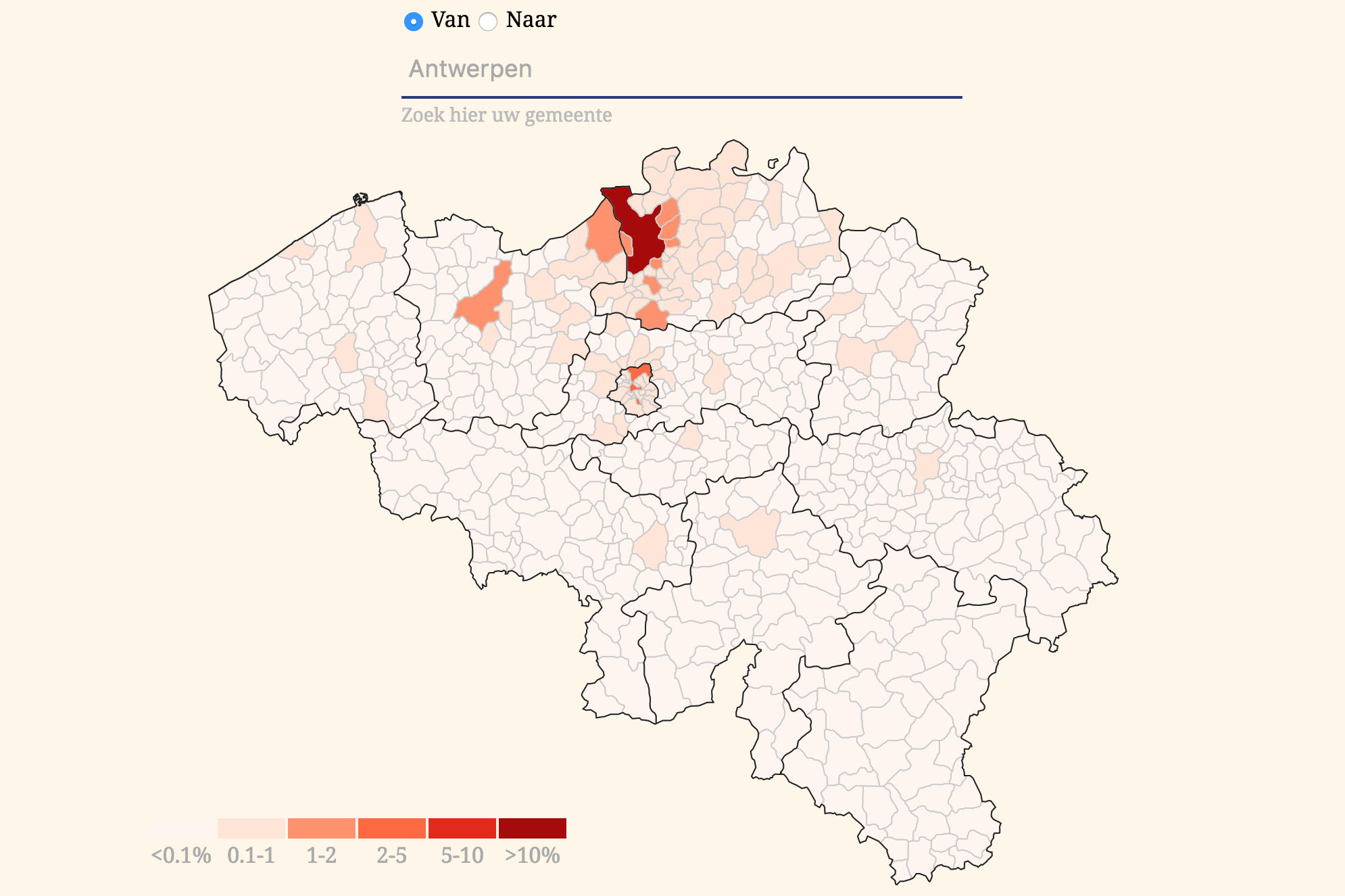
Charts & Maps | Static & Interactive
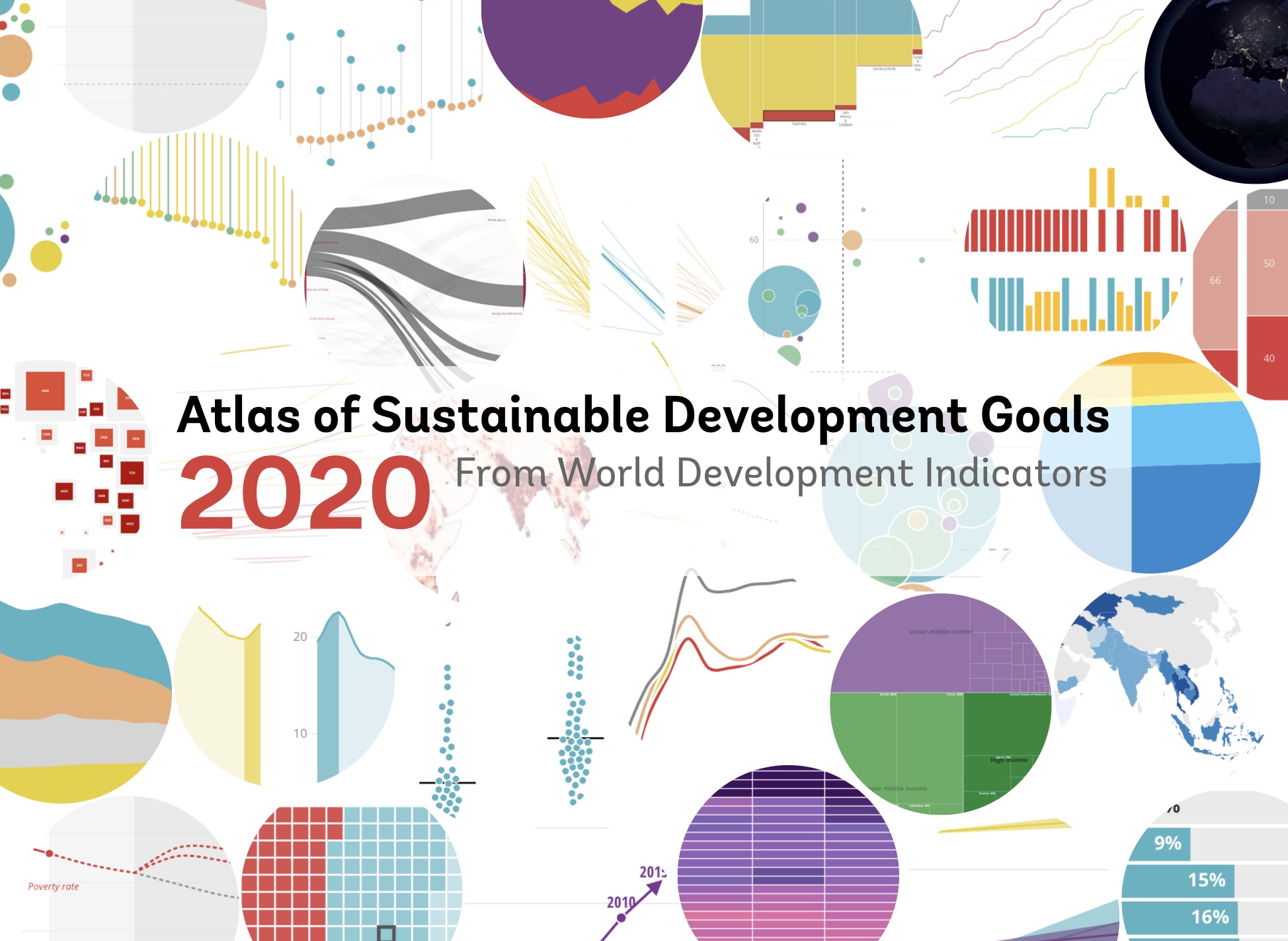
The Sustainable Development Goals Atlas 2020
17 visualization heavy data stories

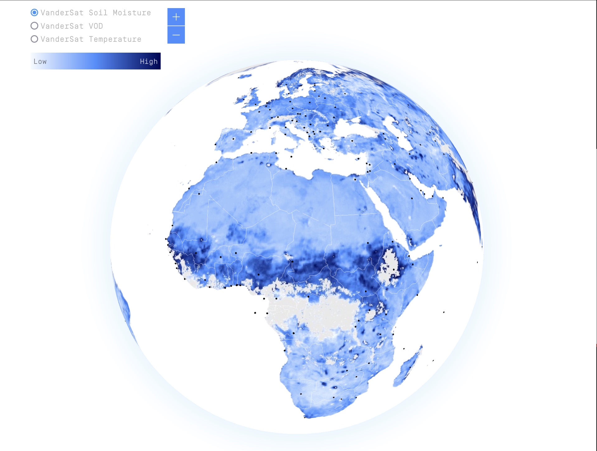
Spinning globe and slippy maps for VanderSat
Satellite data with on-brand color palettes
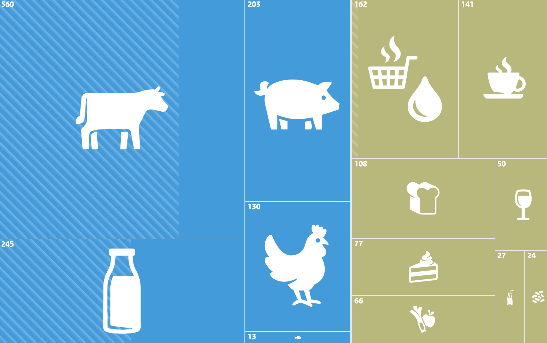
Animated treemap and module to compare menus
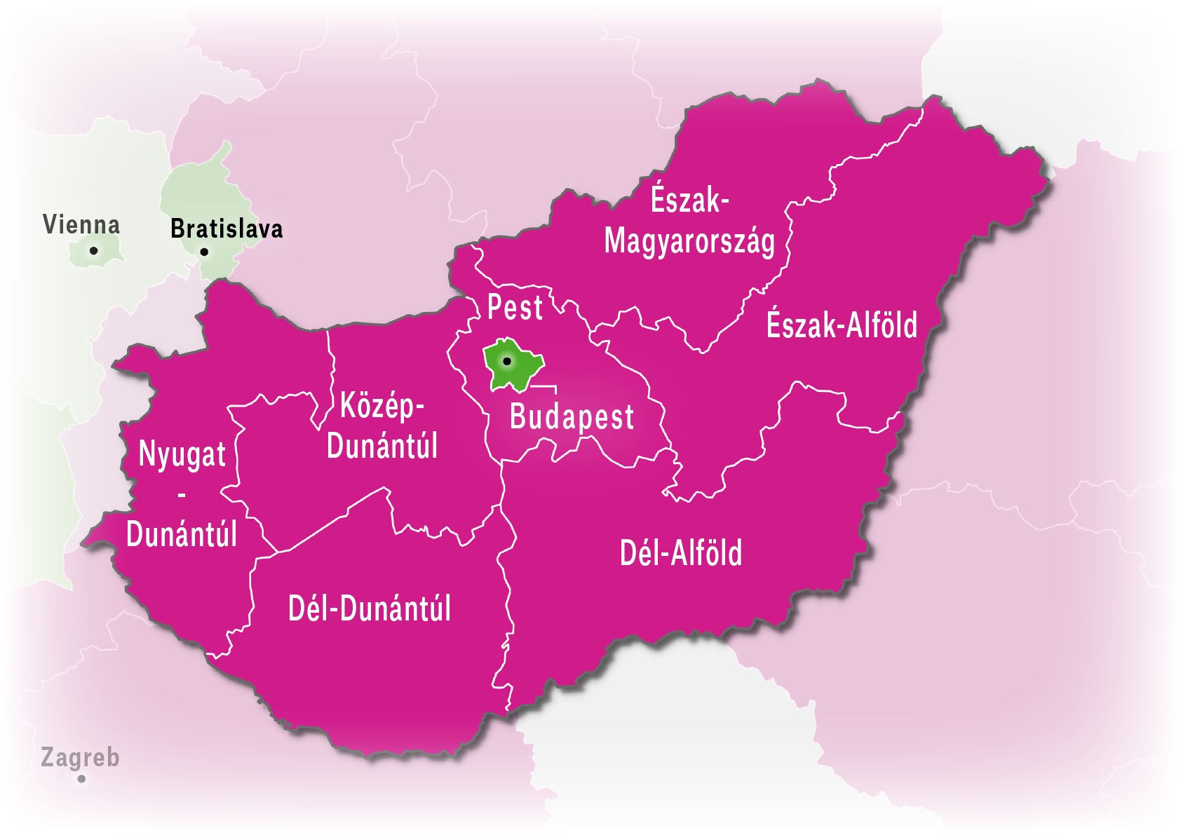
Interactive graphics for the Dutch Planbureau voor de Leefomgeving

Statbel Junior
A tool for children and their teachers to become familiar with the figures and concepts of public statistics

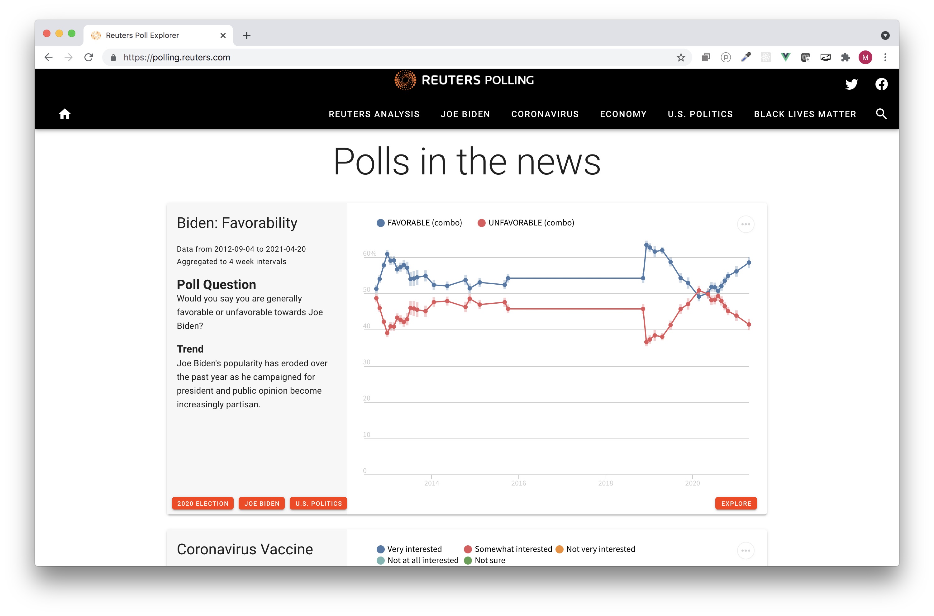
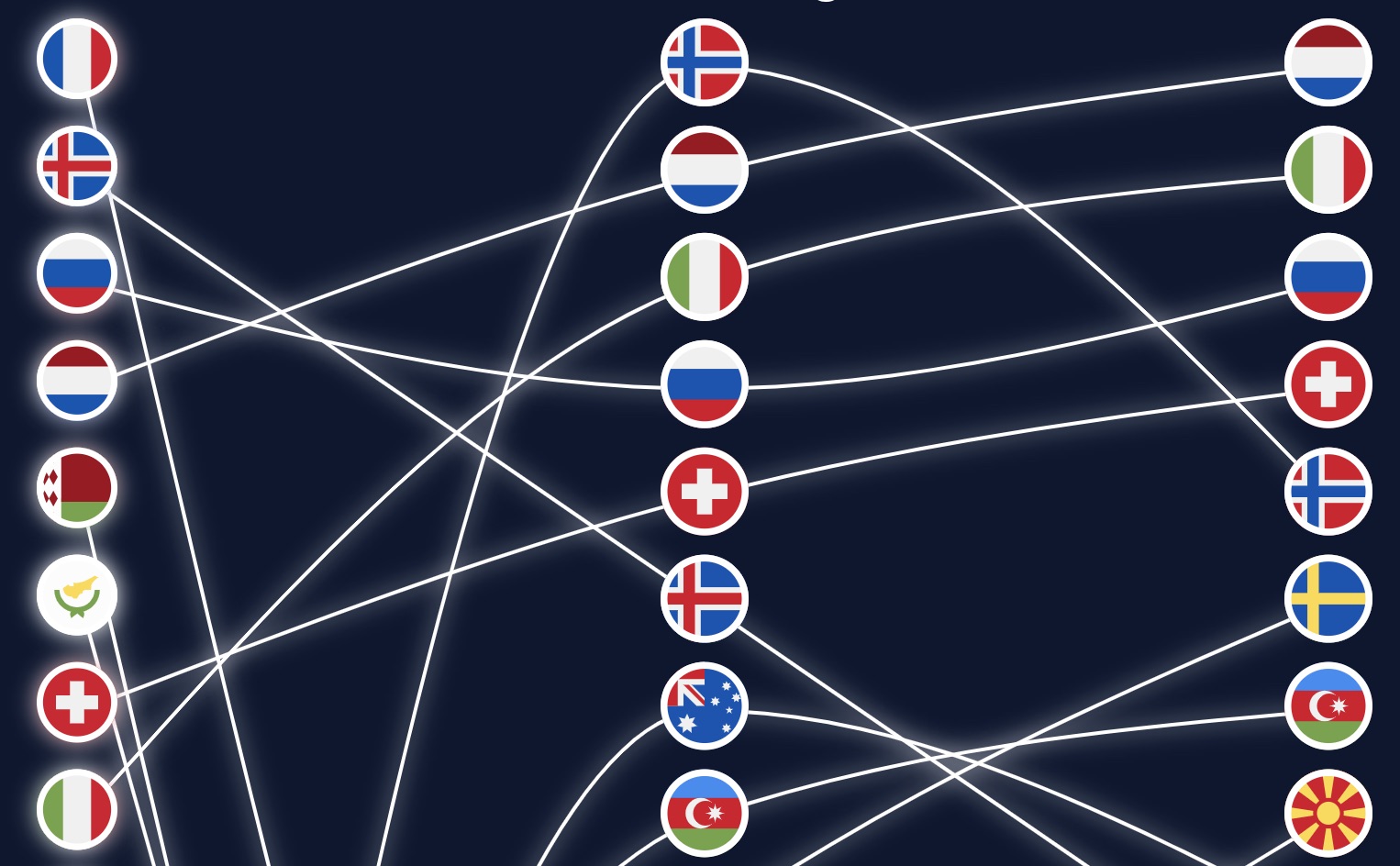
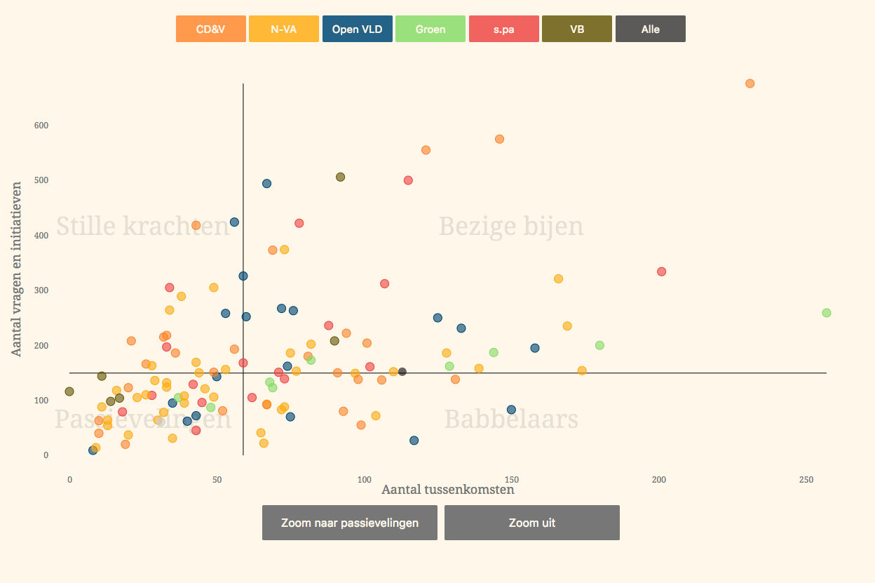
Rock 'n Poll
An interactive that tells the story of PollLand. Explains the statistics and uncertanty in polling visually and animated, without using a single statistical formula
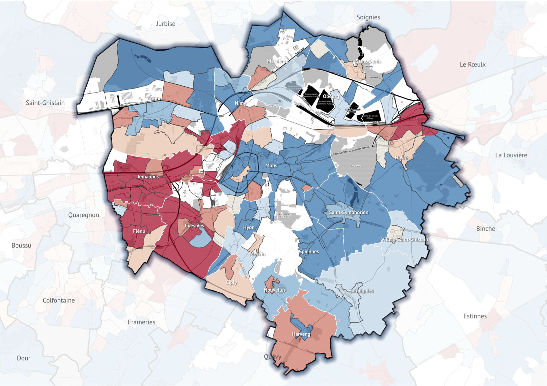
How expensive is your neighbourhood?
Enter your (Belgian) home address and check if you live in a neighboorhoud with higher or lower real estate prices
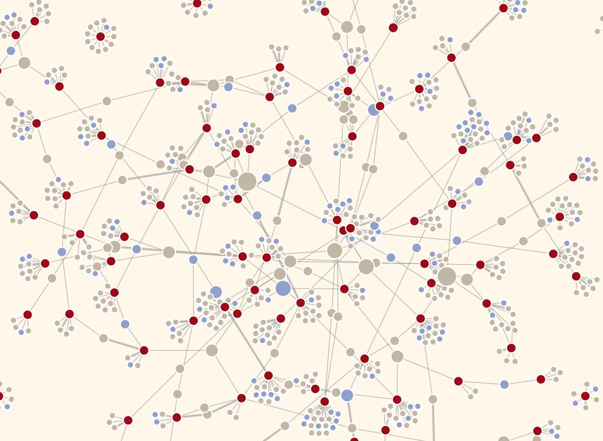
Spider web of Belgian listed companies
How the 126 Belgian listed companies are connected through their members of the board
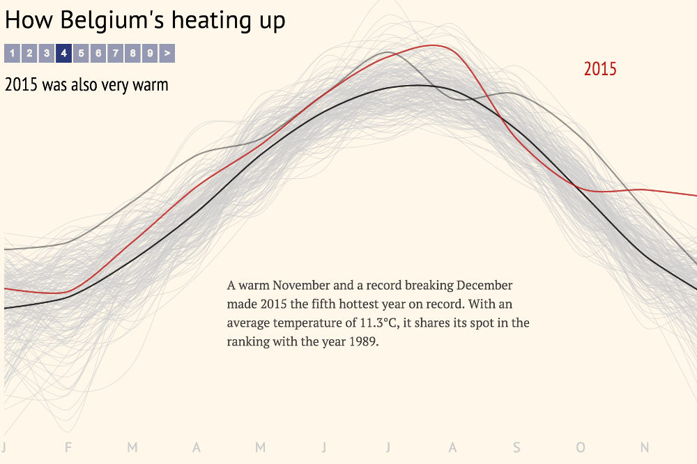
How Belgium is heating up
This chart shows how monthly average temperatures are rising in Belgium are rising, in 9 steps

Hire me
Just leave a message, email me or tweet me, I will get back to you as soon as possible.
Maarten Lambrechts
+32 488 242 996
Koningin Astridlaan 65
3290 Diest
Belgium