Why Budapest, Warsaw and Lithuania split themselves in two - the making of
September 04, 2019
This is the making of of Why Budapest, Warsaw and Lithuania split themselves in two.
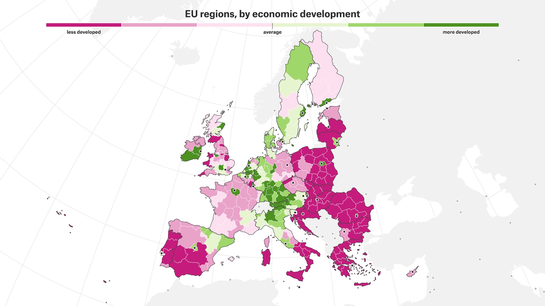
So I had an itch. Ever since I saw this map-chart combo about regional economic development in the European Union, I wanted to do something with the data and the visuals.
I first pitched a story about it already some years ago, while I was still working at newspaper De Tijd. But back then I didn’t have a clear storyline, nor a news angle and the programming skills to convince my editors to build something out of it.
But at least I had a half baked prototype (please don’t scroll too fast, and never scroll up!). And at the beginning of 2018 I made the decision that if I had some time on my hands, I would invest it in publishing something I cared about personally.
Enter The Pudding, “a digital publication that explains ideas debated in culture with visual essays”. I was a fan from the very beginning, and enjoyed them publishing innovative interactive data visualisation pieces, being succesful at it and growing their team with some amazing talents. What I especially like is how they invite freelancers to pitch stories, and get paid for it.
So I went for it. I sent them a link to my prototype and some explanation on how I saw the further development of the story.
I was a bit curious for their answer, as most of their pieces are quite US centric and they hadn’t published many pieces about politics (let alone EU politics). But they were enthusiastic about working with me, and also liked the pitch!
Killing darlings
My main contact was Matt Daniels, and together with him I worked on finding the right focus and storyline. We used a Google Doc to organise our discussions. I just checked: by the end of the project the Doc with feedback, explanations and guidance was 20 pages long. Going back and forth with Matt was always nice. He and the Pudding team gave me a lot of freedom, but also posed me the right questions to push me in the right directions.
Firstly, I used RMarkdown to sketch out ideas for the storyline and the visuals. It was only on the third try that Matt and I got the feeling the story was on the right track.
The first version of the story sketch, The Divided Regions of Europe, had a description of available and possibly relevant data sets, and completely lacked a coherent story or message: it went all over the place, with various charts included just to see how things looked like. Many of the charts would not survive.
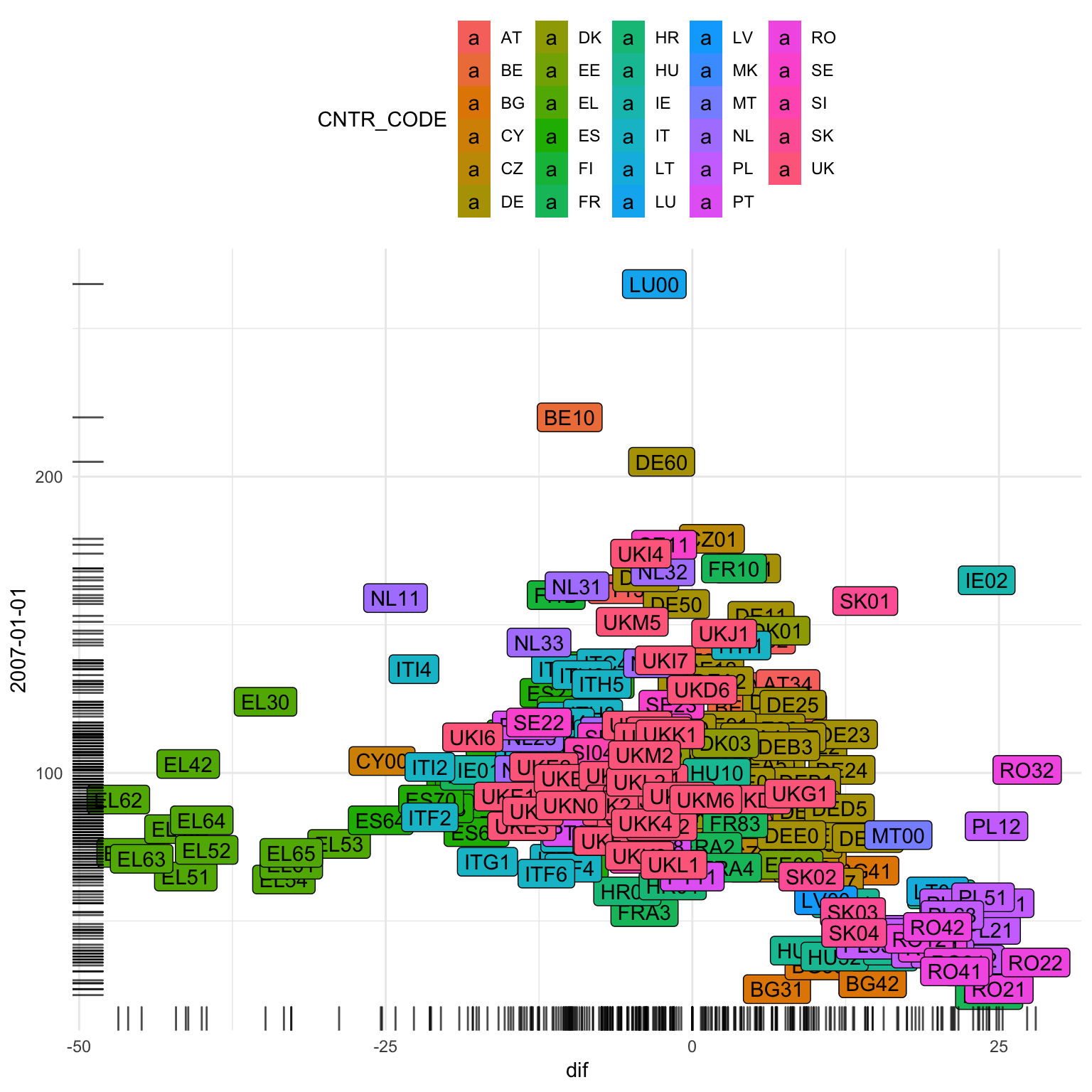
With the second version, Creative accounting and gerrymandering, EU style, I focused on 2 possibly interesting storylines: suspicious histograms that suggested creative bookkeeping by EU regions, and regions changing their boundaries as a response to the rules of how EU money is distributed.
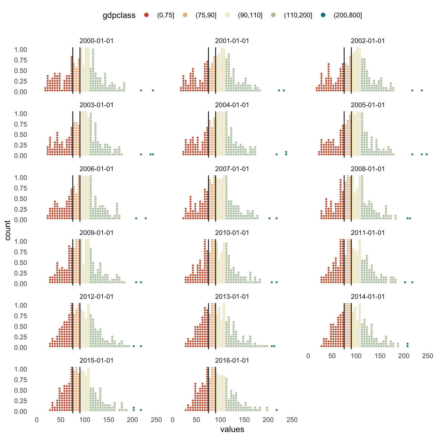
I really liked the suspicious histograms, and I went to talk to some people who knew more about the subject (people from the European Commission, people from Eurostat, and other statisticians). But unfortunately their message was pretty clear: it is almost impossible for regions to manipulate their economical statistics they report to the EU. So I had to kill that darling too.
So I looked a bit more into the “gerrymandering EU style” storyline. And this proved to be a nice one. So in the third sketch version of the story, Why Budapest, Warsaw and Lithuania split themselves in two I focused on that. It is already carrying the title of the final piece, and the main storyline is also close to the final version.
If you check the dates on these sketches, you’ll notice that 2 and a half months passed between the first sketch and the third one. I actually pitched the story mid September 2018 and the piece was published on April 18 2019. Such is the luxury (and the curse!) of working independent from the news cycle. A big thanks to The Pudding for all their patience!
Technical stuff
Although the initial story sketches used data from various sources, the final piece uses data from Eurostat only. I have to thank the authors of the eurostat R package on my bare knees, they have made my work a lot easier (and not only for this project). With the package, I downloaded the data and then filtered and reshaped it so I could use it in D3.js. The package also gives you access to the geographical boundary data, which I converted to topojson files with the geojsonio package. The R script I used for this is on GitHub.
The main map of the story is made with D3.js. I chose an equal area projection fit for Europe.
One of the powers of animation in data visualisation is that you can have object constancy when animating from one view of the data to another. I wanted to make sure the reader understood that what they where looking at on the dot plot was actually the same as what they where seeing on the map. So I definitely wanted the map to morph into the plot.
To pull that off, I used Flubber, a library to animate svg shapes by Noah Veltman. On a sidenote: if you want to know some background to Flubber, check Noah’s OpenVis 2017 talk Pulling a polygon out of a hat about it, one of my all time fav conference talks.
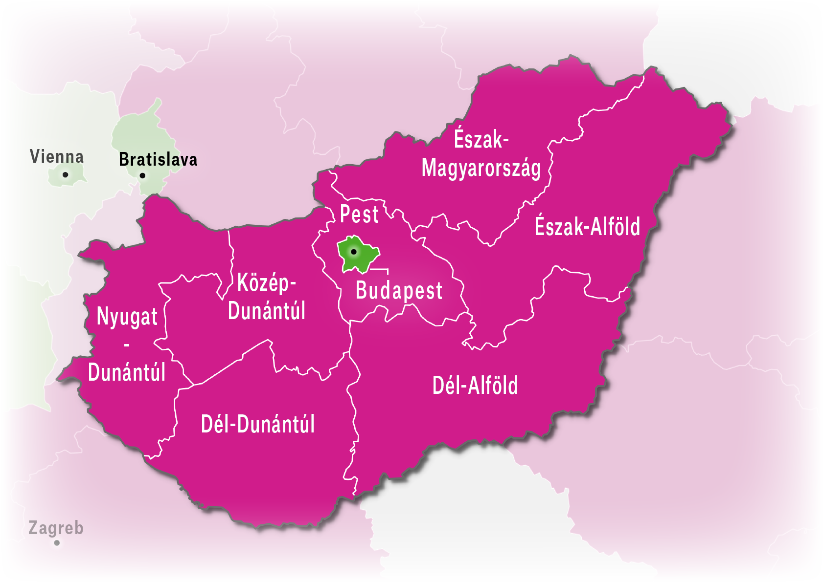
Next to the big interactive choropleth map, the piece also contains 8 smaller static maps. I initially made them as zoomed in versions of the big map, but the results where not really nice, and the performance was also a bit of an issue. So I switched to QGIS, reproduced the choropleths in there (reusing the same color palettes I used for the D3 maps) and added the annotations in Illustrator.
Then to put everything together, I used the starter boiling plate from The Pudding. It took some time to learn how everything fits together, but luckily the README is great and after a while I found it a real pleasure to work with (I actually used the starter in another project too). The boiler plate uses
- ArchieML for managing the copy. This means that all copy edits are done in a Google Doc and the copy is pulled in from there. Very handy.
- Handlebars for templating
- Stylus for css. Also very handy.
The starter has D3 included by default and also has live reload.
Lastly, the heavy lifting of the piece, the scrollytelling was made easy by scrollama.js. Scrollama was developed by Russel Goldenberg from The Pudding. I really love how open the people from The Pudding are about their tools.
All the code and data are on Github, the main javascript file is this one.
Reactions
After publication, the piece got some very nice reactions, also from people from within the EU administration (Reditt, Twitter)
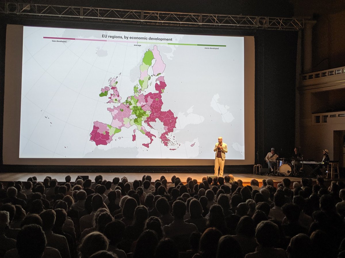
I was also invited to present my story at Live Magazine. This was a challenge, because I only got 8 minutes on stage. But it was a very nice experience putting my animated map on a giant screen for some 1000 pairs of eyes in one of the nicest theatres of the country.
The last I heard was that the piece got over 100.000 page views and a whopping average time on page of 18 minutes. So I think I managed to make a dry topic more engaging with some visuals, animation, and yes, I’m saying it, storytelling :-)
Thanks, Pudding
I want to thank The Pudding for giving me the opportunity to make this piece. And I would definitely like to thank Matt for the countless copy and design edits and suggestions he made: every one of them made the piece better (the idea to not start with the headline? His). It was a pleasure working with you, Matt!
And lastly I also want to thank Mike Bostock for D3.js and topojson, Noah Veltman for Flubber, Russell Goldenberg for Scrollama, Hadley Wickham for ggplot2 and the many authors of the many R packages I used. Without their work, I could not have made this piece, and I could not do what I do on a daily basis.