One-person-one-dot maps and how to make them
February 13, 2018
A couple of days ago, one of my favorite cartographers, Esri’s John Nelson declared his love for dot density maps. I like dot density maps too, but never really thought through why. John put into words really well what’s so good about them:
Dot density maps are self-normalizing: by showing densities (the number of people living somewhere, different nationalities spread out over a big city, number of sheep raised accross a country, …), as, well, densities of dots, you can overcome the biggest drawbacks of traditional choropleth maps. Here is an illustration of that:
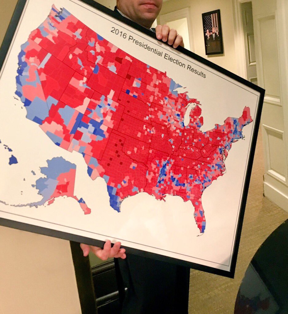
Source: @TreyYingst
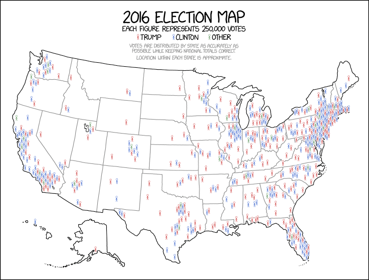
Source: XKCD
Both maps are showing the results of the 2016 presidential election results, but while the first one (on his way to be hung on a White House wall) is a choropleth map greatly overemphasising big-area-but-low-population republican states, the second one is a dot density map showing the election result more accurately by representing every 250.000 voters with a symbol. The map uses icons instead of dots, but the concept is the same.
John’s second argument pro dot density maps is that they can provoke emotional resonance really easily. When looking at a map where one dot represents one person (or one new born baby, one lion, one …), the mental distance to empathize with what is depicted on the map is much smaller then when you are looking at an administrative area shaded with a color representing 1.276 inhabitants per square kilometer, for example. 1.276 people in 1 square kilometer is very abstract, while one person, one baby or one lion is not: you can immediately picture them mentally.
Here are some great 1-person-one-x maps:
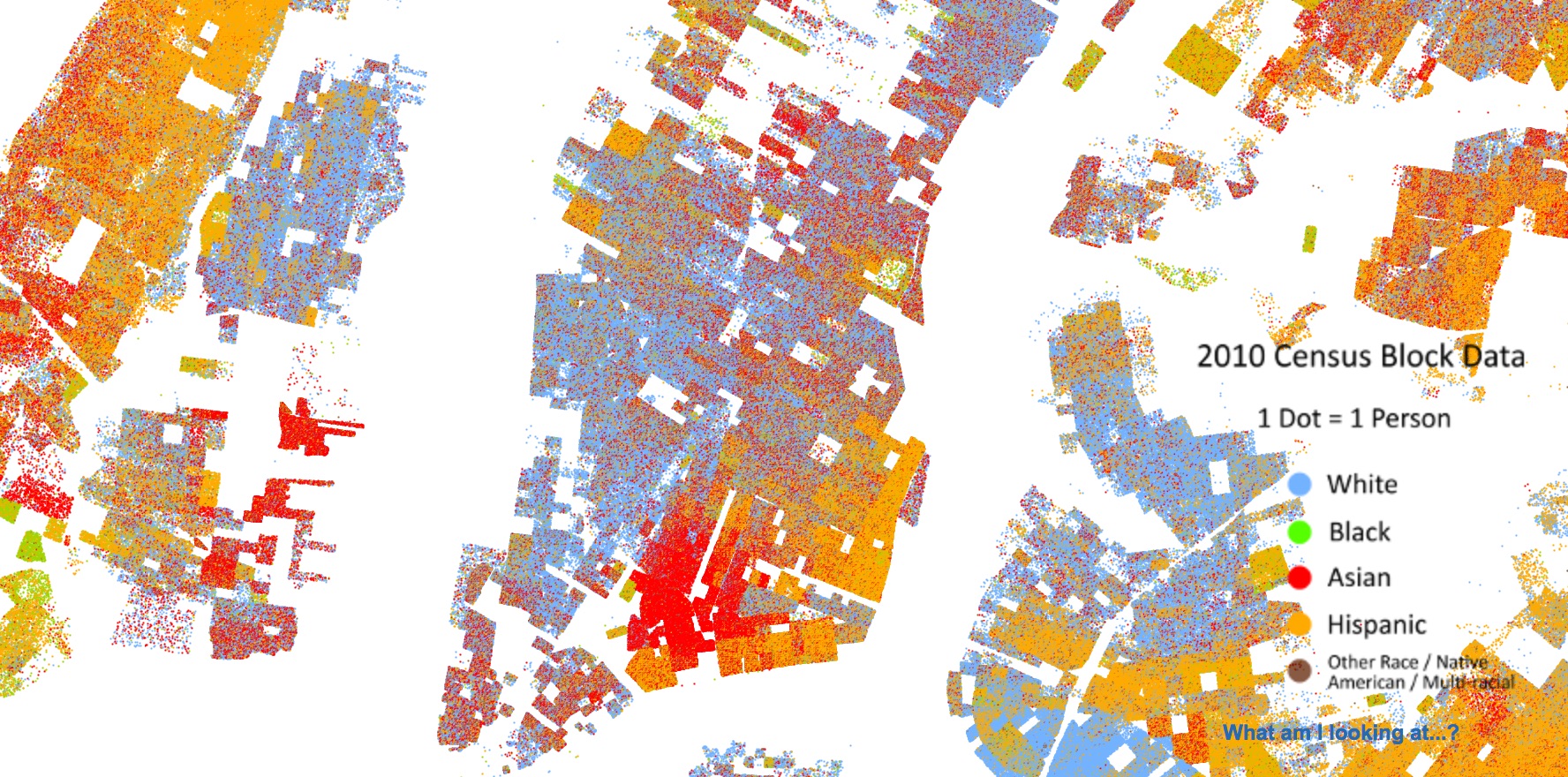
The Racial Dot Map represent every American with a dot, colored by race
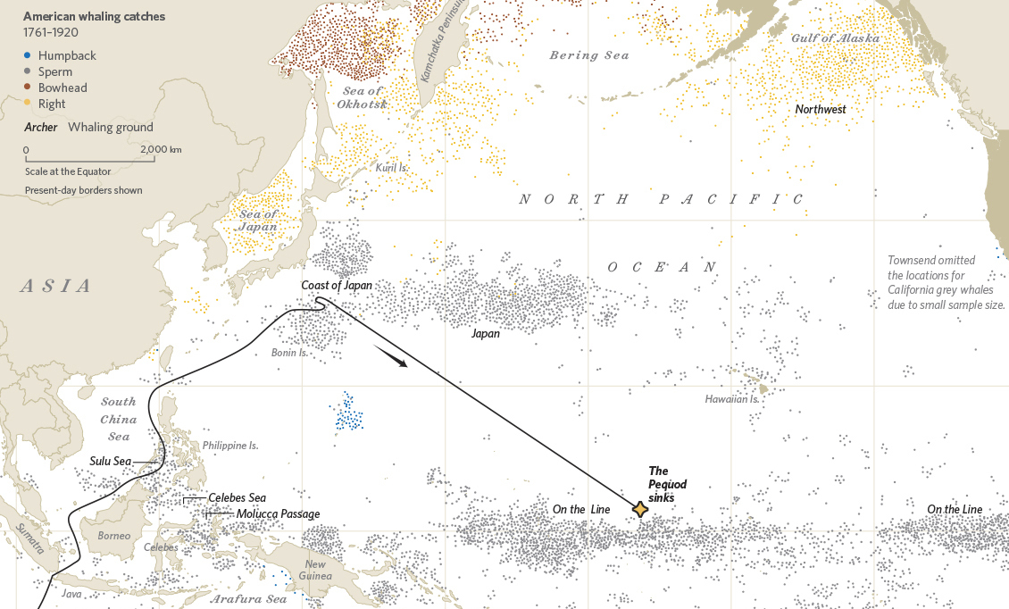
'The Global Hunt', a dot map published in the great 'Where the Animals Go' book, shows 1 dot for every recorded historical whale killing.</a>
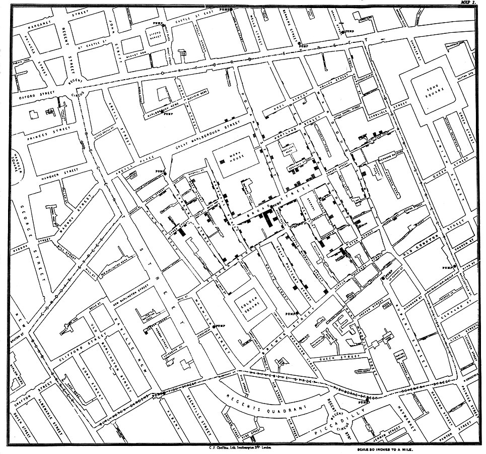
The famous John Snow cholera map. Every dot represents one cholera related death in a London neighbourhood in the 1850's
So I decided to make my first dot density maps. Here’s how I made a 1-dot-1-Belgian map with the open source and free QGIS, mostly following Tom Armitage’s great instructions.
The data
In my country, the most detailed geographical entities at which statistics are published are the so-called statistical sectors. We have some 20.000 of them. On average, they are 1,5 square kilometers in size, but they are much smaller in more populous areas.
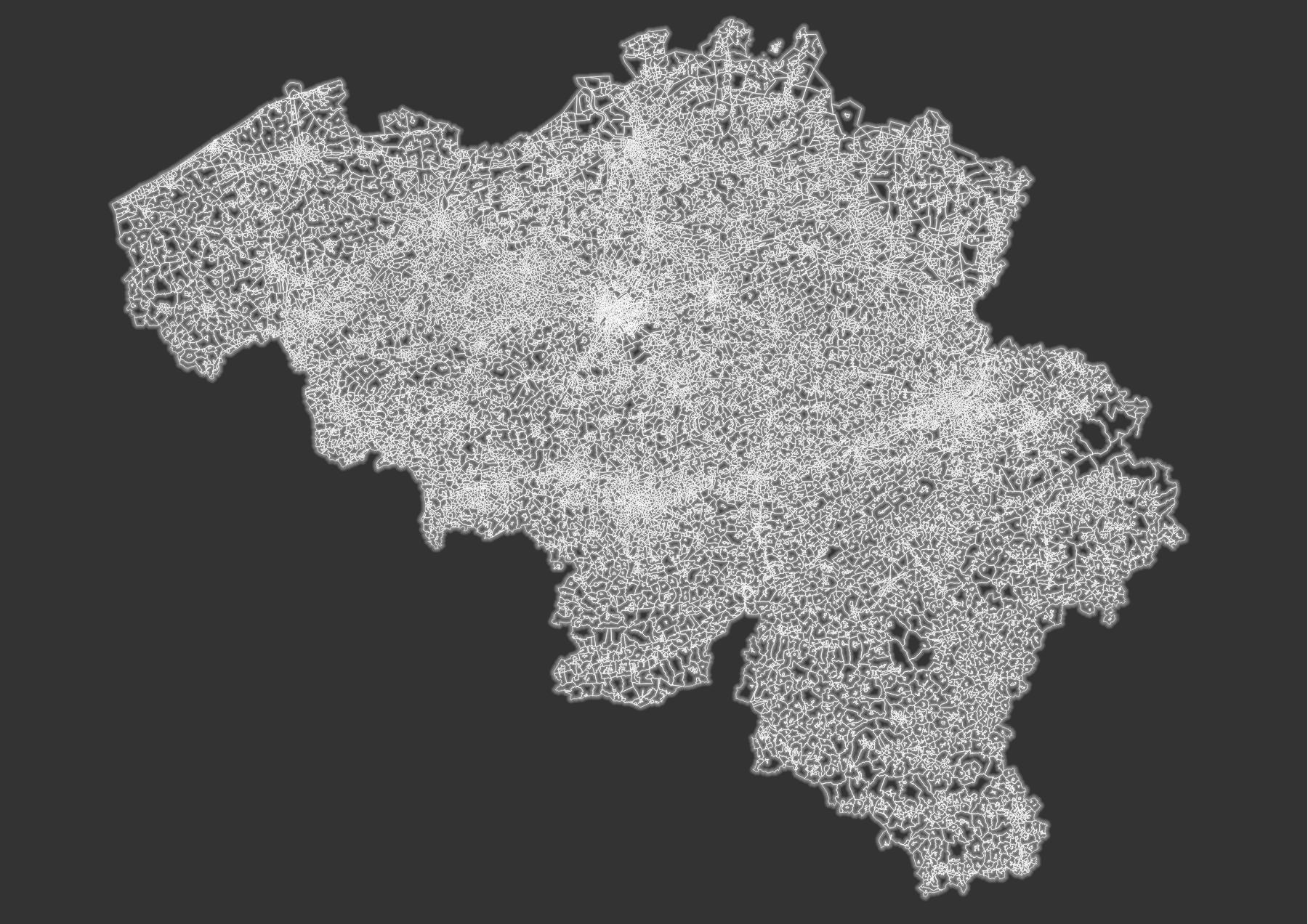
A shapefile of the statistical sectors is published on the Statbel website.
For my first experiments, I used data from the 2011 Census. But I wanted more recent data and so I got the population in every statistical sector on the first of January 2017 from Statbel.
The first thing I had to do was to make sure both the geodata and the statistical data shared the same key to identify each sector, so I could join them together. I had to paste two columns in the Excel-file containing the population data together to do so.
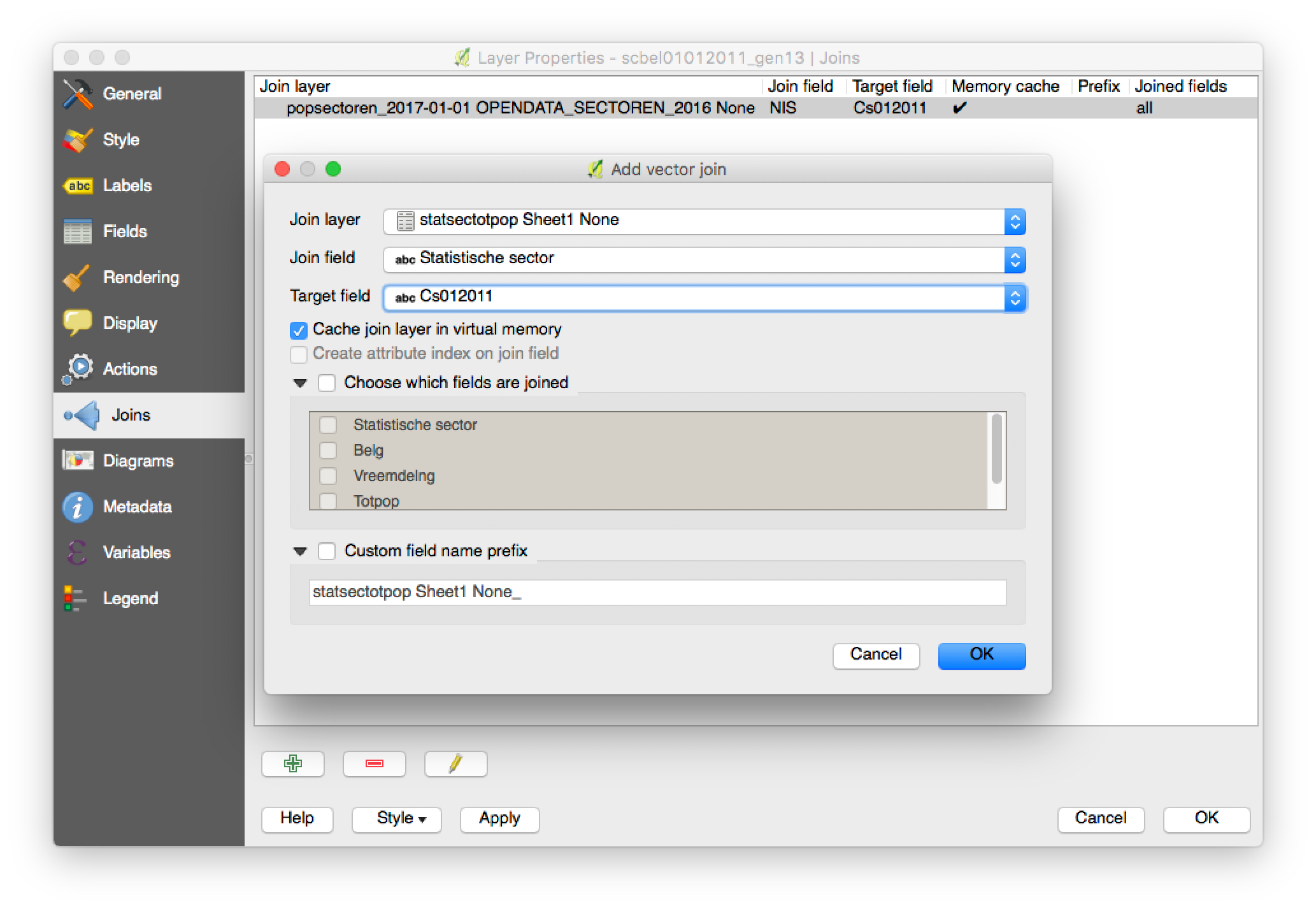
Joining the data was done in QGIS: I added both files, went to the properties of the geodata and added the join. Weird, but very good to know: you can open an Excel file in QGIS by just opening it as a vector layer.
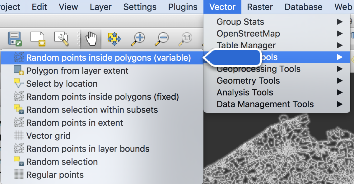
After that, I used the ‘Random points in polygons’ command, under the Vector => Research tools to generate the dots. This command takes a polygon layer and uses a numerical attribute of the polygons (like the population) to generate a number of dots at random locations within each polygon.
I selected the layer with the joined data as the input layer, the joined population data field as the number field and specified the output file type and name (I saved it as a shapefile). I kept the sampling strategy and minium distance on the default.
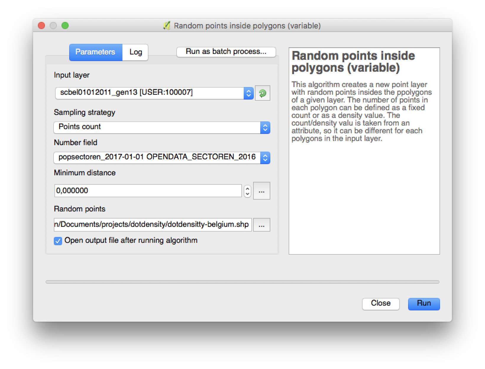
And then it was time to grab a cup of coffee and do something else for a while: generating 11,3 million dots is something to chew on, even for my Macbook Pro.
It took about an hour to generate all the points. And then:
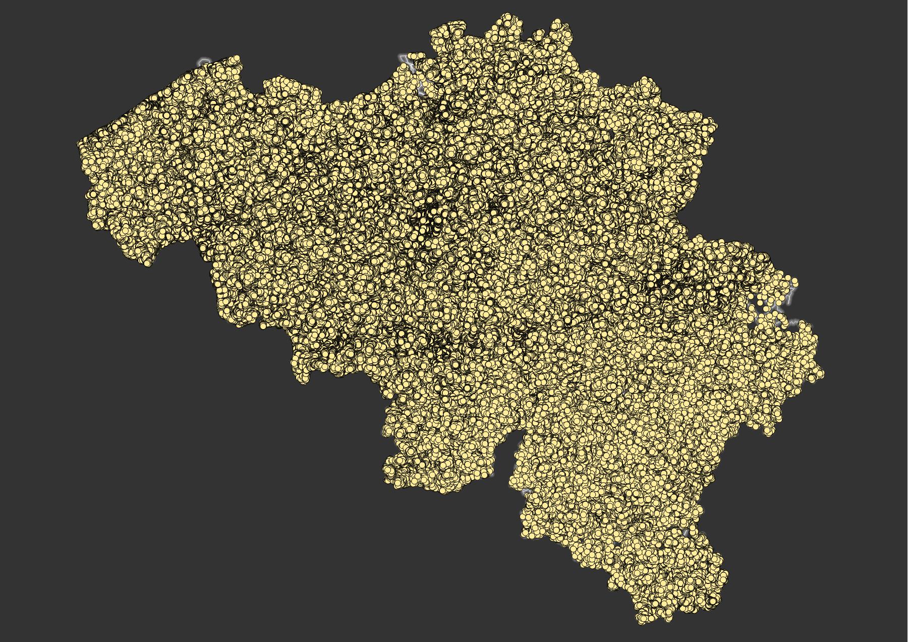
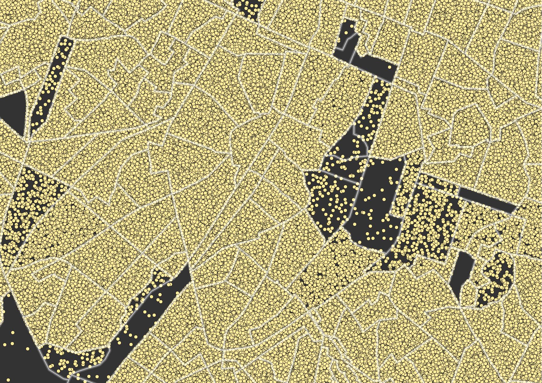
Not very informative yet: the QGIS default dots are too big and they obscure each other. I fixed this by setting the dots to be only 0,1 mm in size, have no outline and have only a 10 % opacity.
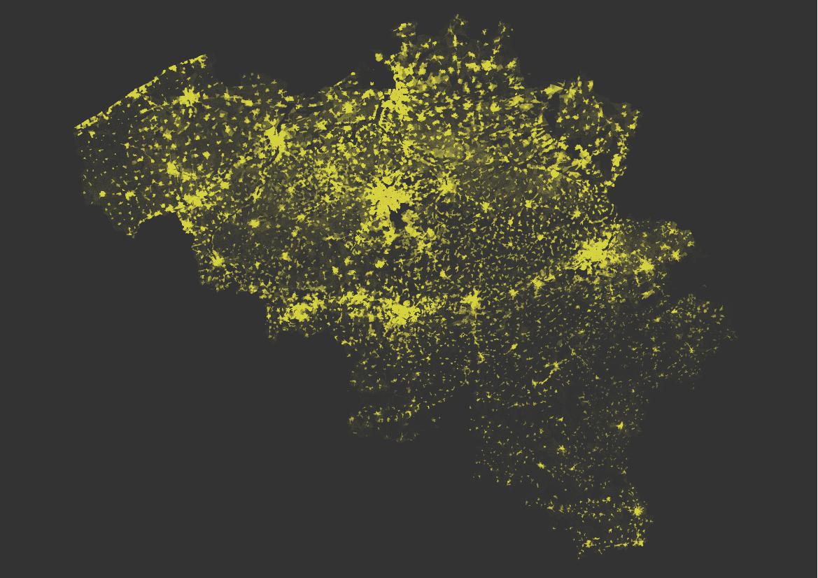
I like the ‘population haze’ that is covering most of Flanders on this map: a perfect metaphor for the disastrous spatial planning and the resulting dispersed settlement patterns in my region.
Let’s zoom in on Brussels.
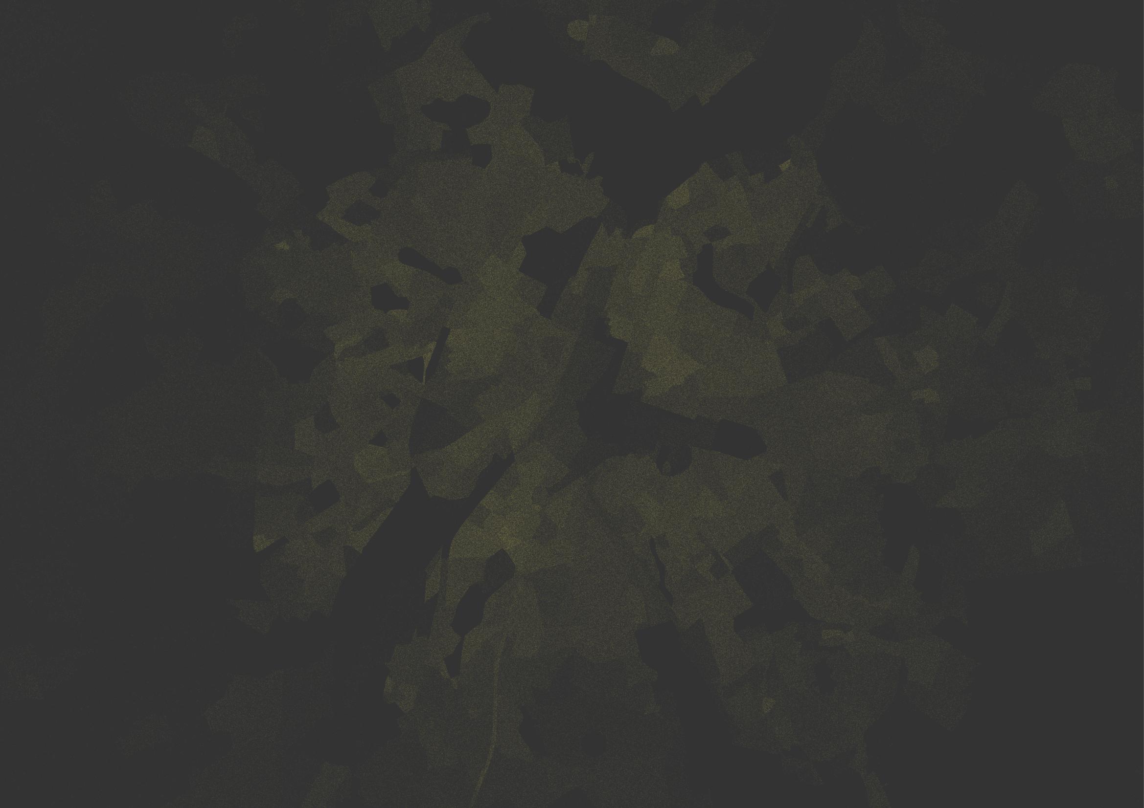
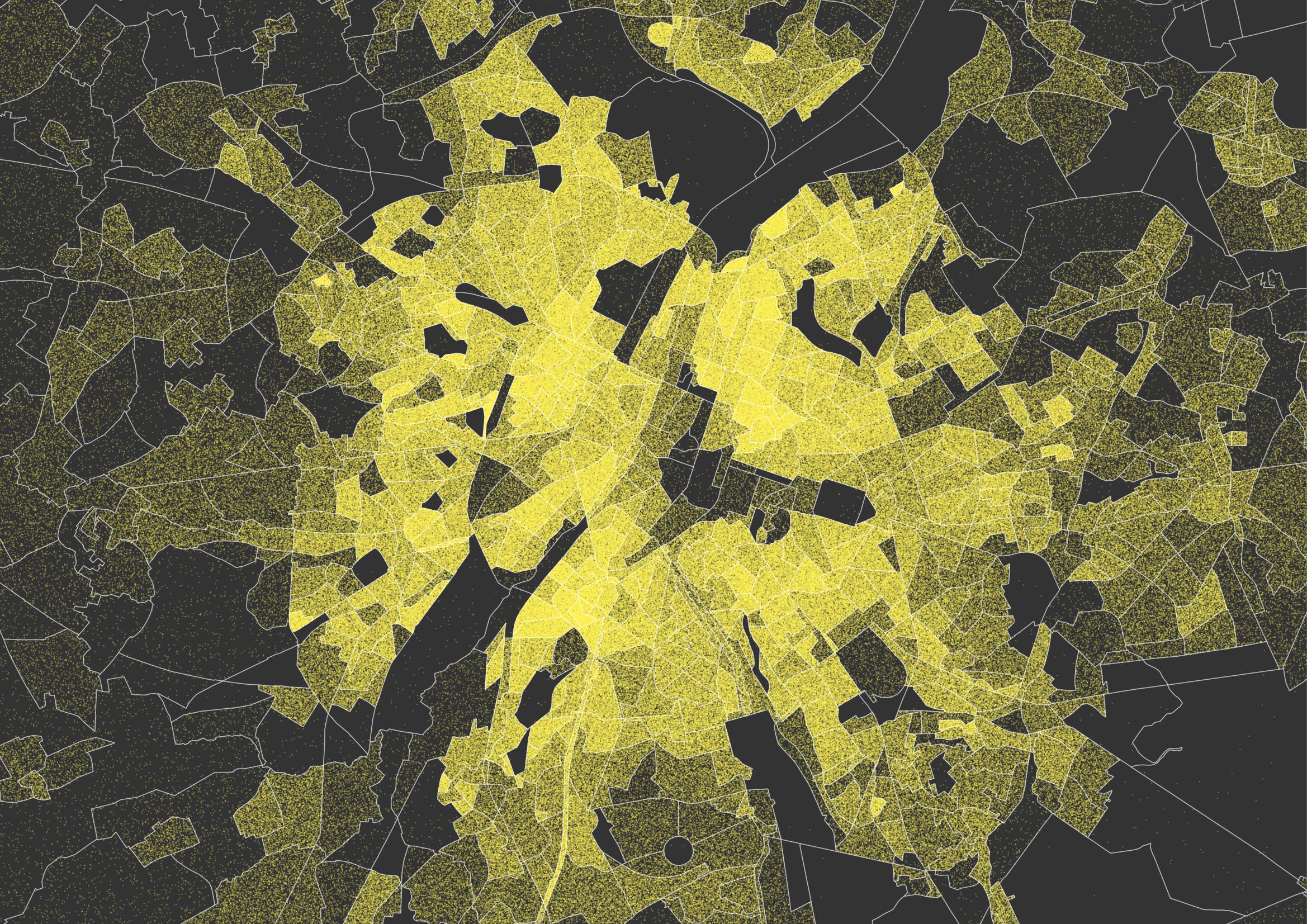
Hm, there is almost nothing to see here. The problem is that I zoomed in, but the dots still had the same size and same opacity as in the map that shows the whole country. So I needed to scale the features on the map to the new zoom level. After some trial and error, I stuck with dots that are 0,3 mm in size and have an opacity of 33%.

I like this map. It shows clearly that residential areas are not spread accross the city evenly. And the dots show a nice effect on both ends of the density scale: for less densely populated areas you can assess the population by “counting” the yellow dots, for densely populated areas you can “count” the black dots peaking through all the yellow.
Here is the same map with the statistical sectors overlaid. You can recognize the pentagonal inner ring way in the center.
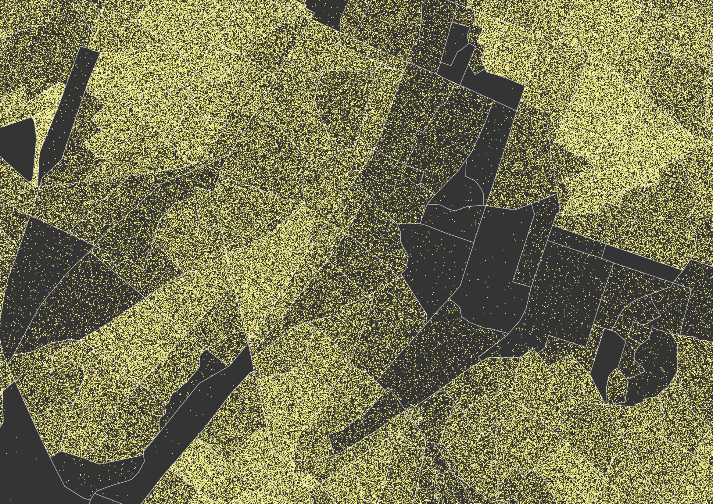
But at this zoom level, the individual dots are not yet really identifiable. For this, we need to zoom in some more (and adjust the size and opacity of the dots again to make them visible at this level).
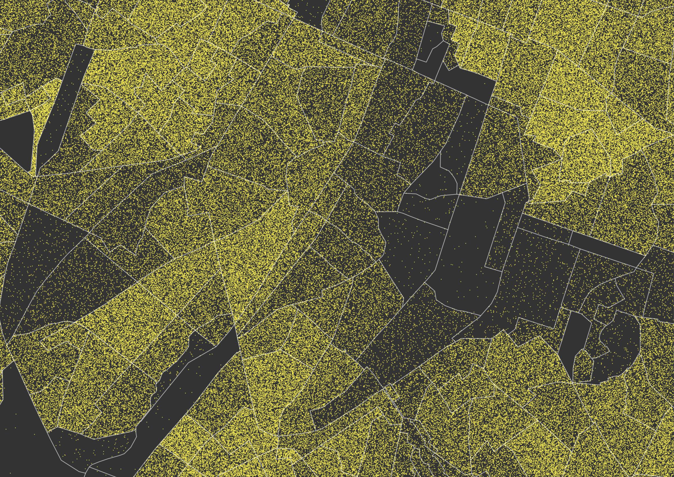
And there it is: a map with a dot for every Bruxellois(e)!
The dots are still small and becaus they have some transparency, they are not very bright either. One solution is to reduce the transparency and set the blending mode to ‘screen’.
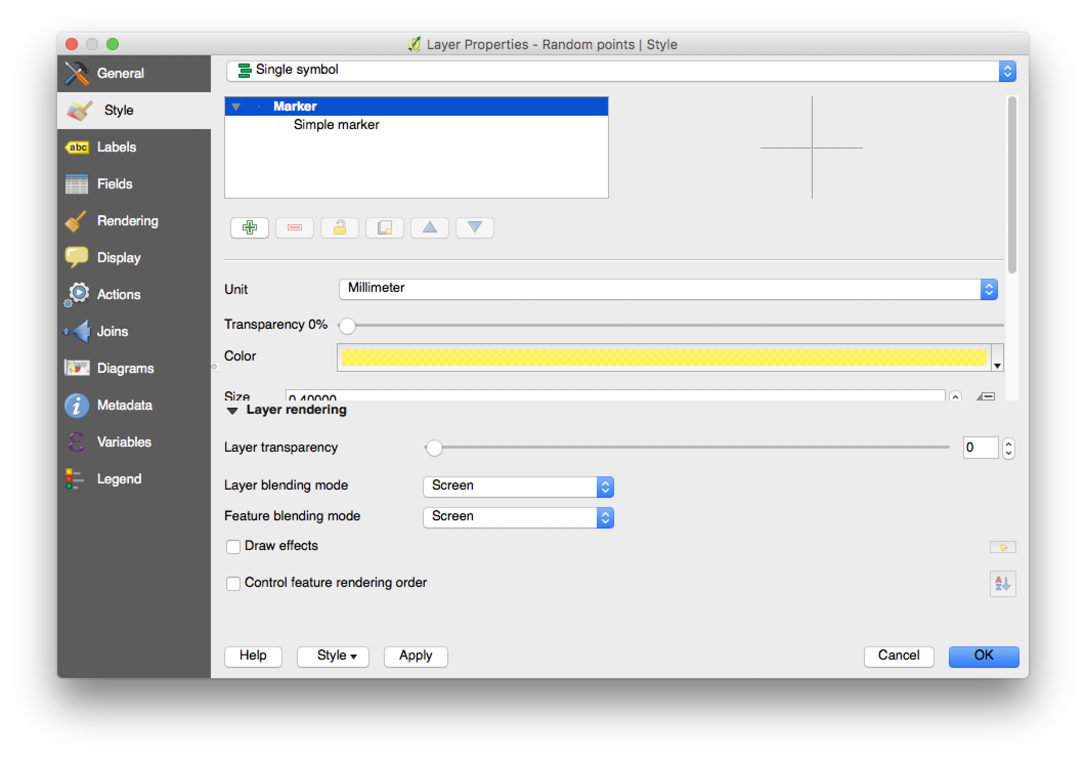
In this way, overlapping dots result in brighter yellow instead of darker.
One thing I would like to do is make the same map, but use building outlines to place the points in. That would result in a map more in line with reality. And I would very much like to expand this experiment and make an interactive map out of this. Let’s see how that goes!