The list of 2017 visualization lists
December 28, 2017
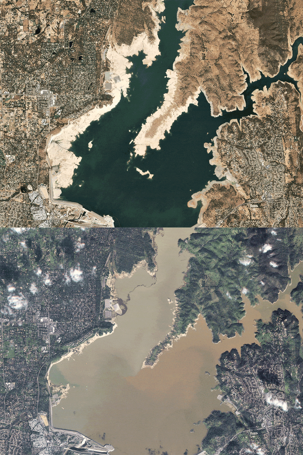
Looks like I’m really turning this into a yearly habit. So here is my list of visualisations, charts, graphics, satellite journalism and science photography lists, version 2017.
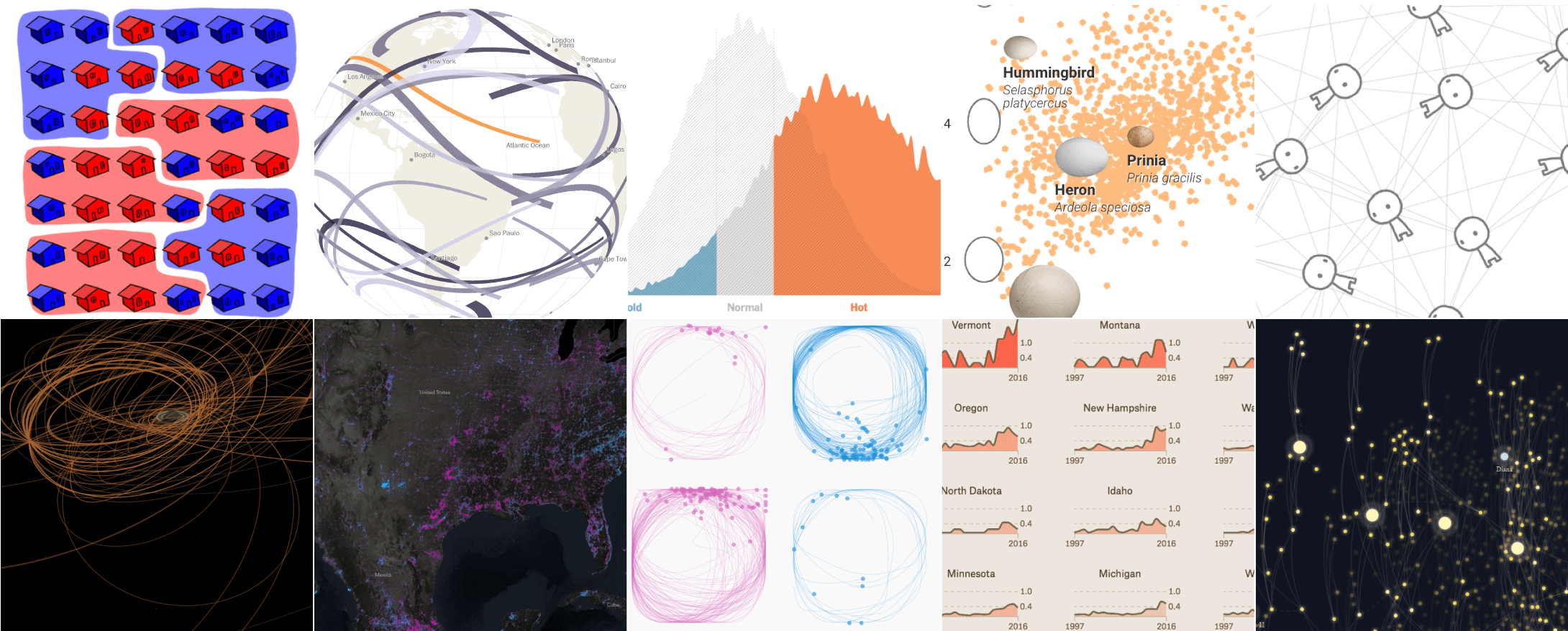
1. @FlowingData: 10 Best Data Visualization Projects of 2017
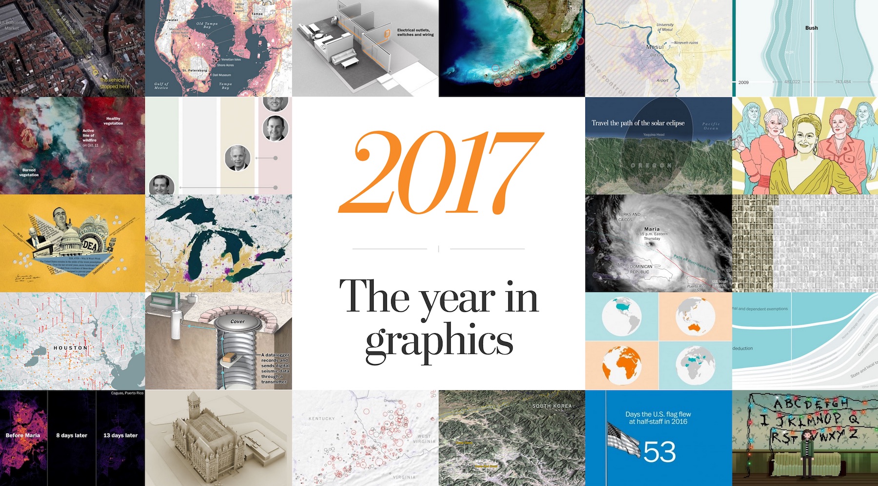
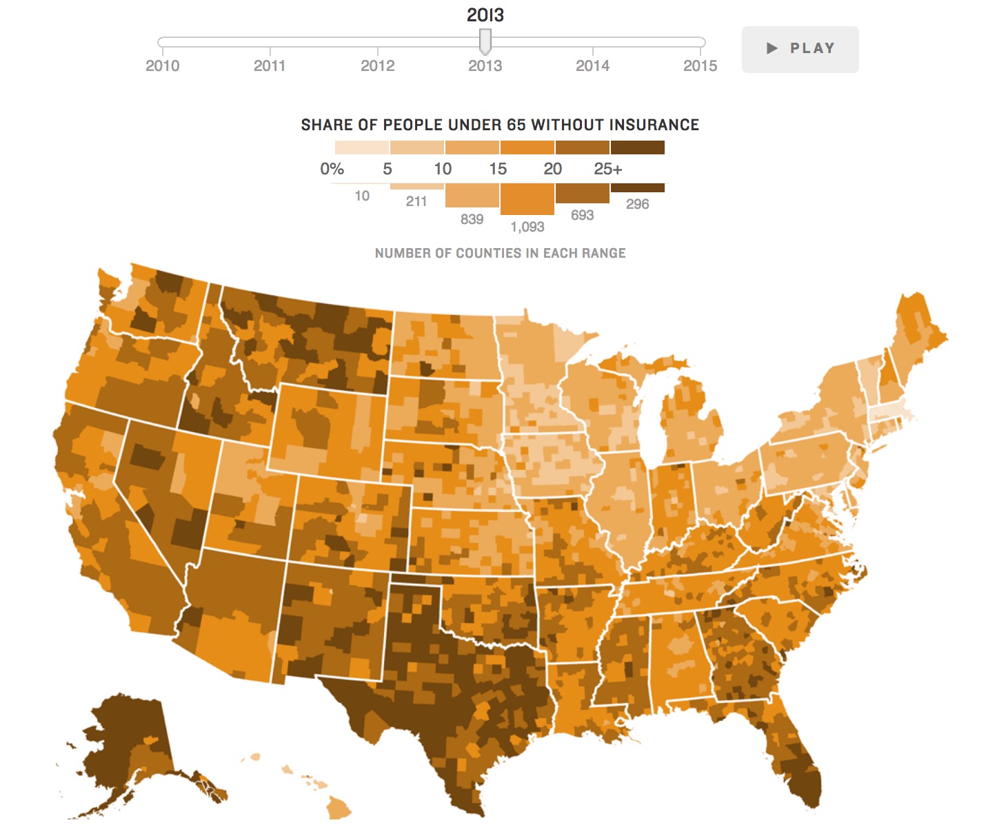
2. @PostGraphics: 2017: The year in graphics
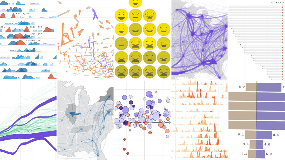
3. @NYTGraphics: 2017: The Year in Visual Stories and Graphics
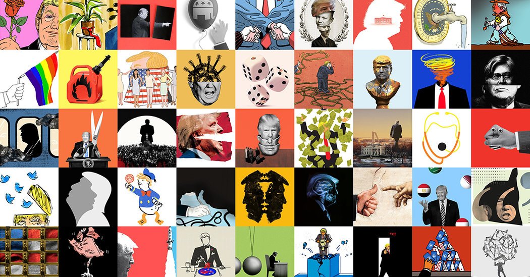
4. @NYTOpinion: 2017: The Year in Visual Opinion Stories
5. @ReutersGraphics: The Best of Reuters Graphics 2017
6. @AxiosVisuals: Our favorite data visualization projects of 2017
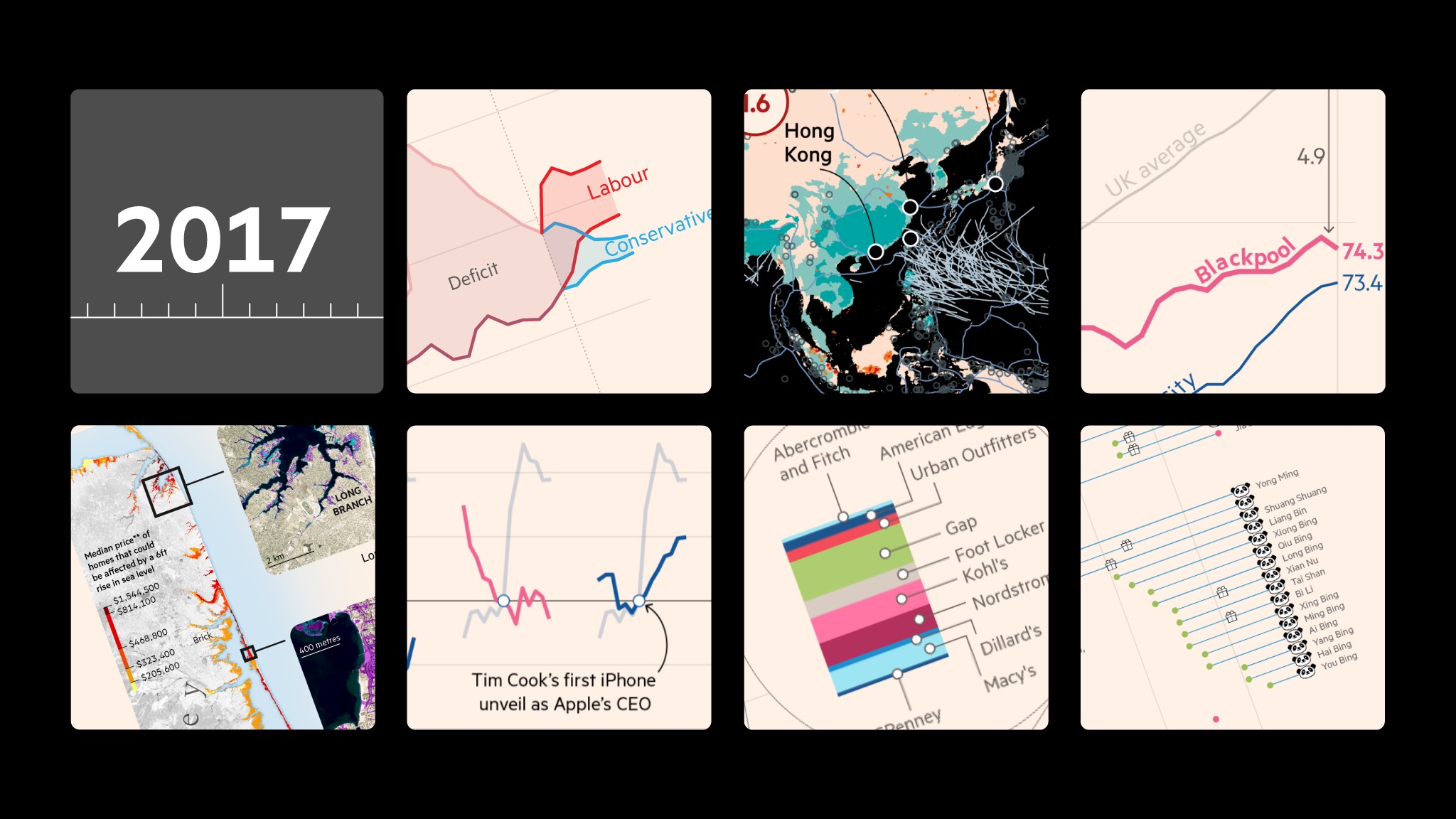
7. @ftdata: Design secrets behind the FT’s best charts of the year
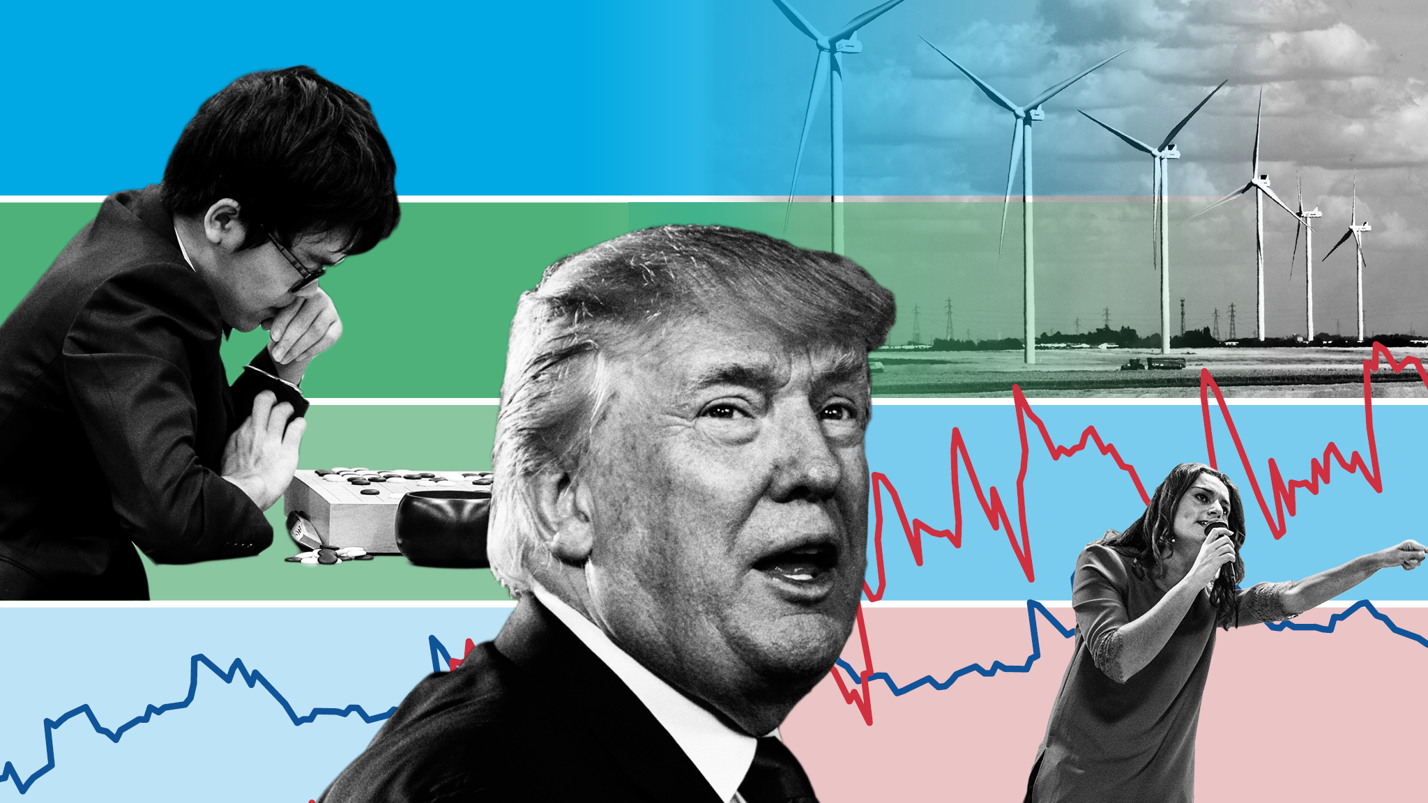
8. @ftdata: A year in charts: From bitcoin to Trump and chess playing robots
9. @NPRViz: Favorite Visual Stories Of 2017
10. @GuardianVisuals: 2017 in Guardian Visuals: a thread of our biggest 📷 🌍 📈 projects of the year
11. @HackAStory: 40 best digital stories of 2017
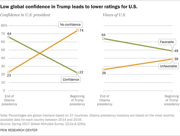
12. @PewResearch: 17 striking findings from 2017
13. @visualisingdata: 6 monthly reviews of the best of data visualisation
January to June (we are all waiting for the July to December post to be published). You can find all the ‘Significant developments in visualisaton’ here.
