The list of 2016 visualization lists
December 29, 2016
I’m turning this into a yearly habit. Last year I collected what I found were the most interesting lists of the visualizations of the past year and put them… in a list. So here is my list of lists, version 2016.
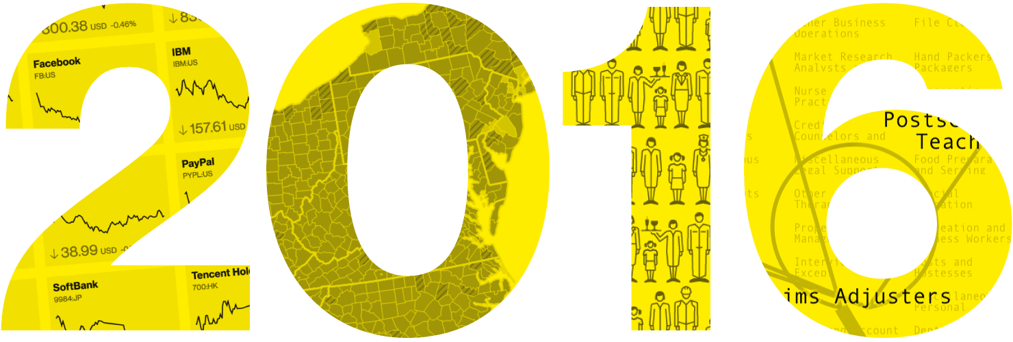
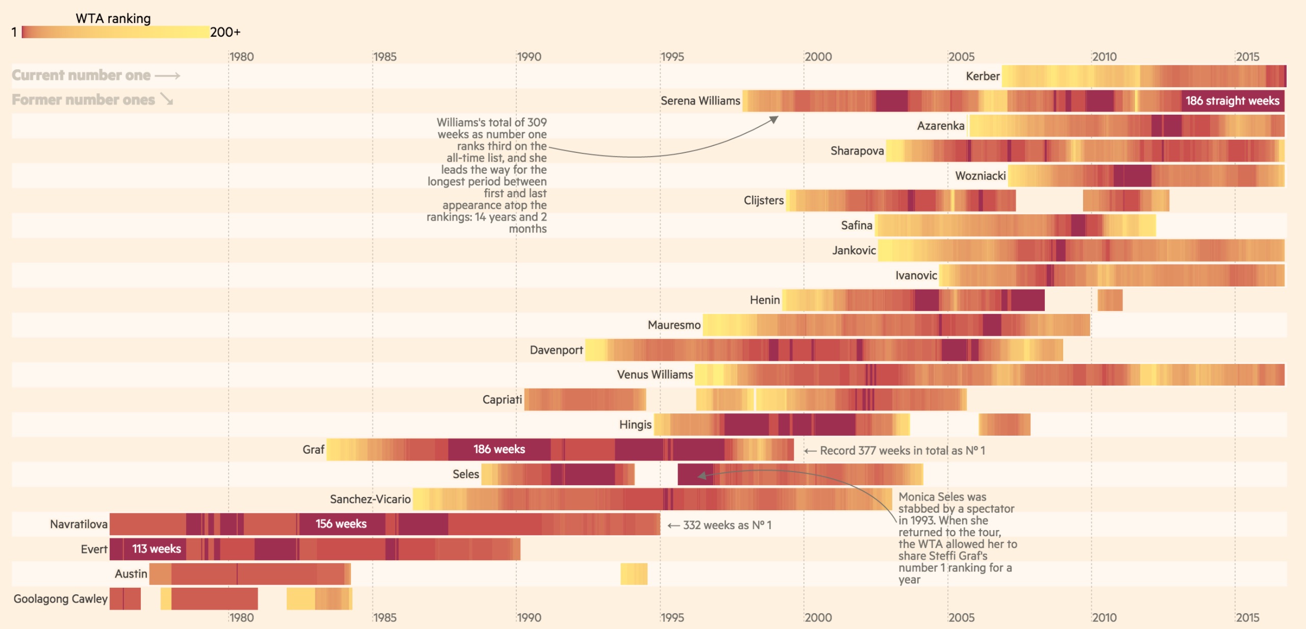
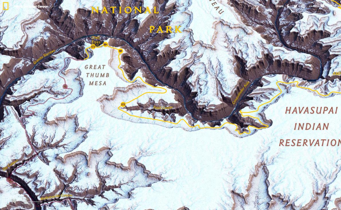
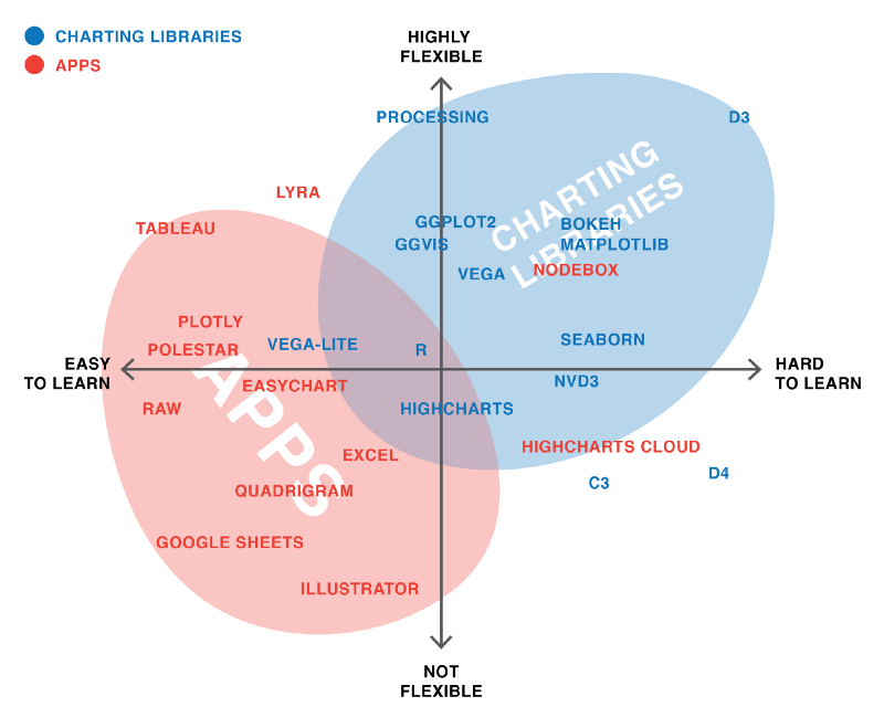
1. The charts of 2016
My selection of the charts and maps that tell the stories and trends of 2016.
2. @PostGraphics: The year in must-see visualizations from The Post
With a special section of the Post’s election coverage (including a ‘Show me a random graphic’ button!)
3. @visualisingdata: 6 monthly reviews of the best of data visualisation
January to June and July to December. Or all of them.
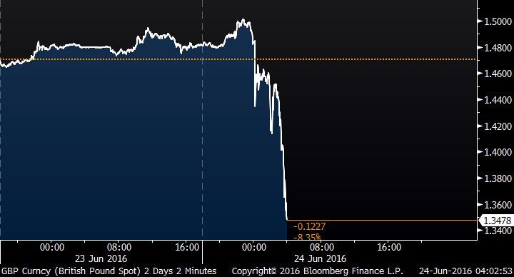
4. @BBGVisualData: A Tumultuous Year Explained in 129 Graphics
5. @robminto: The 10 best sports graphics and data visualisations of 2016
6. @NatGeoMaps: The best maps of 2016
7. @evansinar: The 10 Best Data Visualization Articles of 2016
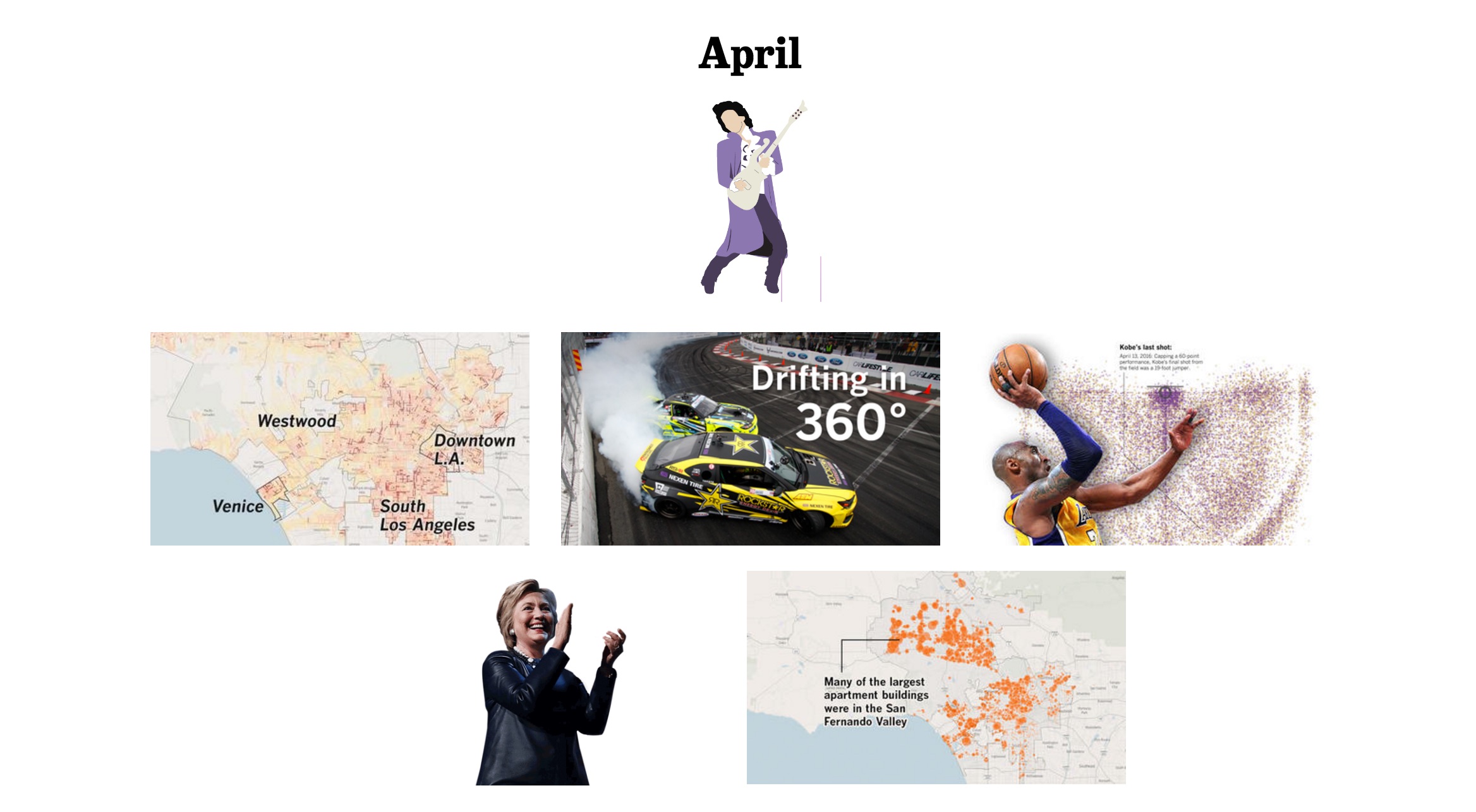
8. @LATimesGraphics: Dear 2016: A letter from the L.A. Times Data Visualization Department
9. @kennethfield: Favourite maps from 2016
10. @WSJGraphics: The Best WSJ Graphics and Visual Stories From 2016 (🔒)

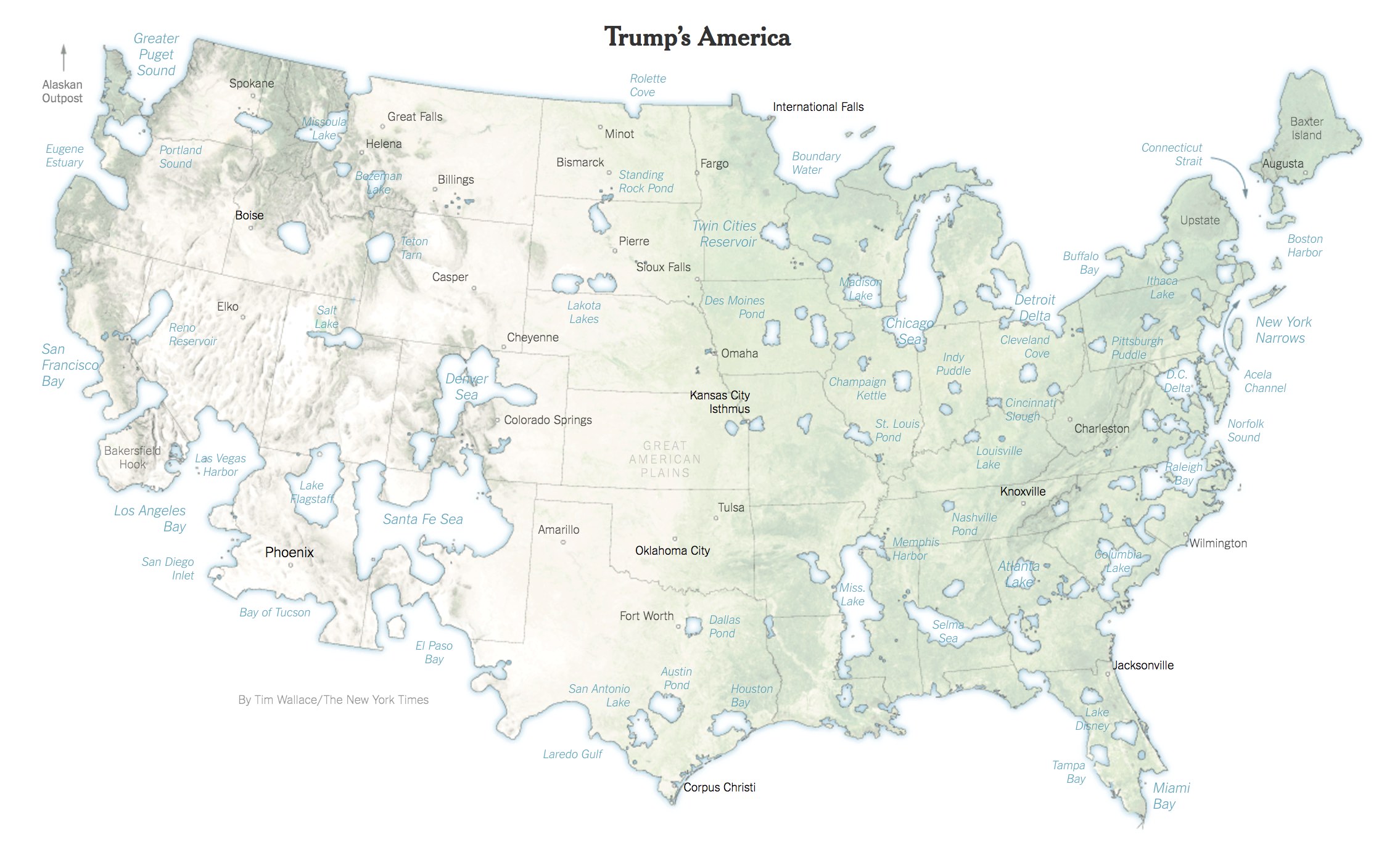
11. @NYTGraphics: 2016: The Year in Visual Stories and Graphics
12. @Nature: 2016 in pictures: The best science images of the year

13. @Flowingdata: Best Data Visualization Projects of 2016
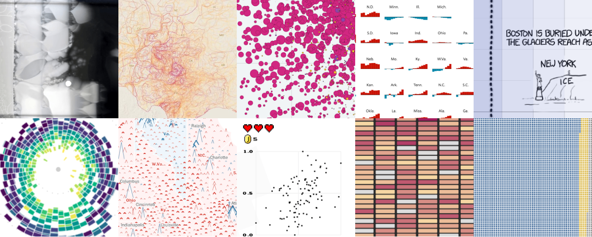
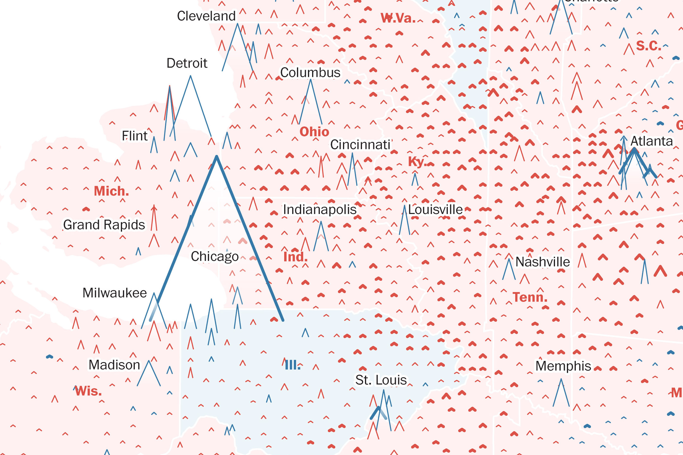
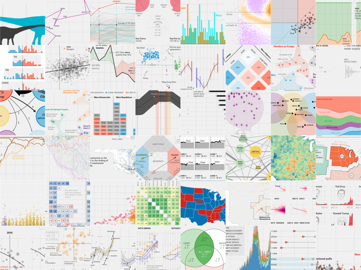
14. @FiveThirtyEight: The 52 Best — And Weirdest — Charts We Made In 2016
15. @FiveThirtyEight: The Best And Worst Data Stories Of 2016

16. @ProPublica: The Year in Visual and Interactive Storytelling

17. @htTweets: The year in graphics and visuals
18. @ONS: Visual 2016: That was the year that was

19. @HuffingtonPost: Must-See Visualizations And Investigations From The Huffington Post
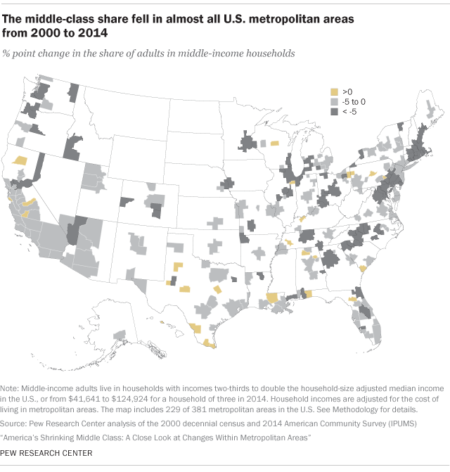
20. @PewResearch: 16 striking findings from 2016