Zoomable scatter: cancer prevalence and survival rates
April 23, 2016
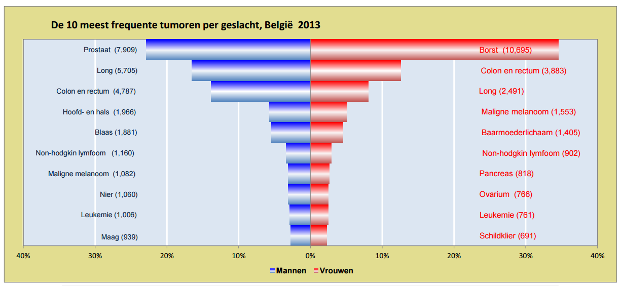
Last Friday, De Tijd published a multimedia article on cancer in Belgium and immunotherapy. To set the stage, the author wanted to include some numbers on the prevalence of different types of cancer in Belgium. This was the original chart (fantastic how they replicate the gradient in the legend):
My colleague Raphael Cockx, who produces our multimedia articles, saw ‘some room for improvement’ and obtained the data behind the graphic plus additional data on survival rates for the different cancers. He passed the data to me and asked me what we could do with it.
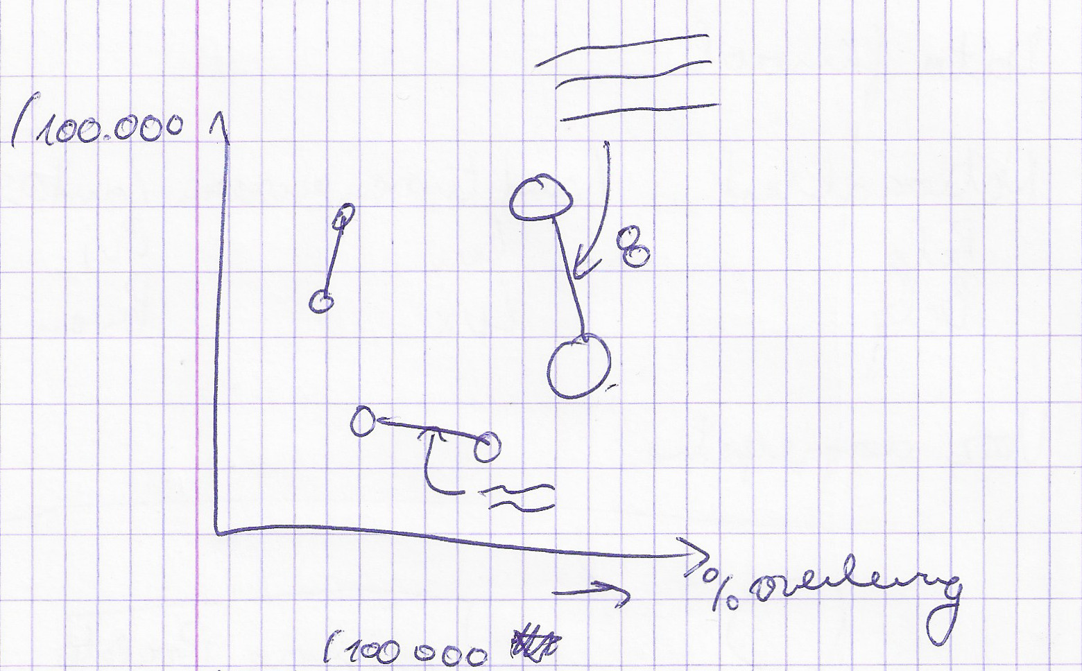
I made a quick sketch and came up with some kind of connected scatterplot, with for every type of cancer prevalence rate on 1 axis and survival rate on the other. Lines connect the dots for both sexes.
I made a first draft with Plot.ly, to see how the data looked like. Although lung and breast cancer are outliers and make all other cancers to be tightly packed at the bottom, there are a lot of interesting things to see in the graph.
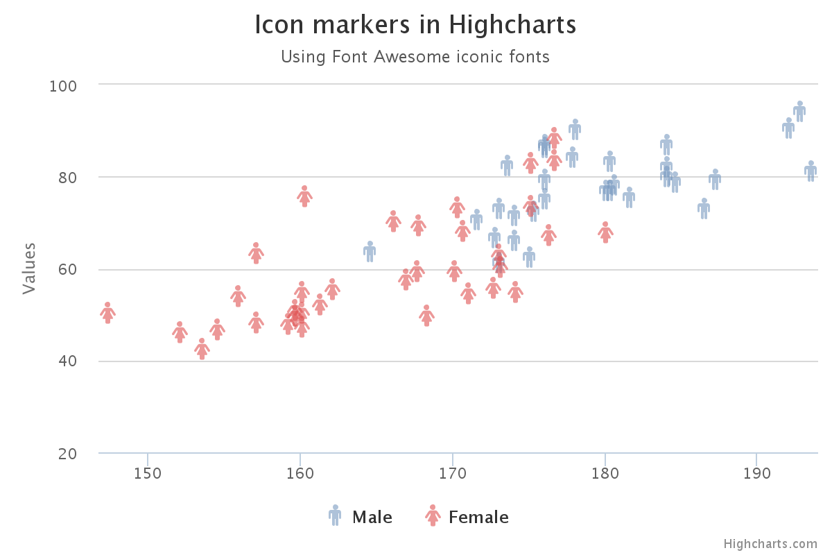
I wanted [icon name="venus" class="" unprefixed_class=""] and [icon name="mars" class="" unprefixed_class=""] symbols for the dots and this is something Plot.ly can’t do. So I looked into Highcharts, becaus I saw an example that used Font Awesome for markers.
But it became clear rather quickly that making what I wanted to make would be difficult with Highcharts too. So it was time to take out the Swiss army knife of dataviz, which is of course D3.js.
I wanted a responsive chart, so I googled ‘D3 responsive scatterplot’, which led me to this block. It already had tooltips with D3 tooltip. This proved to be a very good starting point.
Below is the final result (see it live here, in Dutch). Use the buttons to zoom in and out of the rarer types of cancer, touch the symbols for the exact numbers.
Some code
D3 and svg have some native symbols, but [icon name="venus" class="" unprefixed_class=""] and [icon name="mars" class="" unprefixed_class=""] are not among them. So I had to recreate these symbols with circles and lines in D3. This code groups the circle and the lines for every symbol and translates them to the right place in the scatterplot.
var symbolcolors = {m: "#e86756", f: "#9FA8DA", mout: "#9a0b16", fout: "#3f51b5"};

    //The icons are svg g tags that contain a circle and 2 lines (for women) and a circle and 3 lines (for men)
    //We make one g for every datapoint and move them in their right place by using a translation
    //and the x and y linear scales
    var symbolgroup = svg.selectAll(".symbol")
          .data(data)
          .enter().append("g")
          .attr("class", function(d) { return d.Geslacht; })
          .attr("transform", function(d) { return "translate(" + x(d.Overleving) + "," + y(d.Prevalentie) + ")"; });

     var vrouwen  = svg.selectAll("g.f");
        vrouwen
            .append("line")
            .attr("x1", 0)
            .attr("x2", 0)
            .attr("y1", 0)
            .attr("y2", 20)
            .attr("stroke", symbolcolors.fout)
            .attr("stroke-width", 2);
        vrouwen
            .append("line")
            .attr("x1", -7)
            .attr("x2", 7)
            .attr("y1", 14)
            .attr("y2", 14)
            .attr("stroke", symbolcolors.fout)
            .attr("stroke-width", 2);

        var mannen =  svg.selectAll("g.m");
        mannen
            .append("line")
            .attr("x1", 0)
            .attr("x2", 14)
            .attr("y1", 0)
            .attr("y2", -14)
            .attr("stroke", symbolcolors.mout)
            .attr("stroke-width", 2);
        mannen
            .append("line")
            .attr("x1", 7)
            .attr("x2", 15)
            .attr("y1", -14)
            .attr("y2", -14)
            .attr("stroke", symbolcolors.mout)
            .attr("stroke-width", 2);
        mannen
            .append("line")
            .attr("x1", 14)
            .attr("x2", 14)
            .attr("y1", -6)
            .attr("y2", -14)
            .attr("stroke", symbolcolors.mout)
            .attr("stroke-width", 2);

       symbolgroup.append("circle")
          .attr("r", 8)
          .style("fill", function(d) { return symbolcolors[d.Geslacht]; })
          .style("stroke", function(d) { return symbolcolors[d.Geslacht + "out"]; })
          .style("stroke-width", 2)
          .on('mouseover', function(d) {
            tip.show(d);
            d3.select(this).style("stroke-width", 3);
          })
          .on('mouseout', function(d) {
            d3.select(this).style("stroke-width", 2);
            tip.hide(d);
          });
For the connecting lines between the male and female symbols, I used D3.nest to group the data for males and females for the same type of cancer. Then I filtered out cancer types that only occur in one sex to obtain only cancer types which have numbers for both sexes.
  var linedata = d3.nest()
        .key(function(d) {return d.Soort})
        .entries(data);

      linedata = linedata.filter(function(el) {return el.values.length == 2; });

      svg.selectAll(".connect")
            .data(linedata)
            .enter().append("line")
            .attr("class", function(d) { return "connect " + d.key; })
            .attr("x1", function(d) { return x(d.values[0].Overleving)})
            .attr("x2", function(d) { return x(d.values[1].Overleving)})
            .attr("y1", function(d) { return y(d.values[0].Prevalentie)})
            .attr("y2", function(d) { return y(d.values[1].Prevalentie)})
            .attr("stroke", "grey")
            .attr("stroke-width", 1);
On resize and when the user clicks one of the buttons on top, axes are resized and every element on the chart follows along. This is done by resetting the range of the scales and putting everything on the chart in its new place using the new scales. For the buttons, these transitions are animated.
d3.select("#zoomin").on("click", function() {

        d3.select("#zoomout").classed("pressed", false);
        d3.select("#zoomin").classed("pressed", true);

        //The the zoomed out domain for the y axis is [0,110]
        y.domain([0, 21]);
        svg.select('.y.axis')
            .transition().duration(1500)
            .call(yAxis);
        //Select all the symbols on the graph, male and female, and move them to new location using the new domain
        svg.selectAll("g.m, g.f")
            .transition().duration(1500)
            .attr("transform", function(d) { return "translate(" + x(d.Overleving) + "," + y(d.Prevalentie) + ")"; });

      svg.selectAll("line.connect")
        .transition().duration(1500)
        .attr("y1", function(d) { return y(d.values[0].Prevalentie)})
        .attr("y2", function(d) { return y(d.values[1].Prevalentie)});

      svg.selectAll("text.chartlabel")
        .transition().duration(1500)
        .attr("x", function(d) { return x((d.values[0].Overleving + d.values[1].Overleving)/2); })
        .attr("y", function(d) { return y((d.values[0].Prevalentie + d.values[1].Prevalentie)/2); })
        .style("opacity", 0.4);

    });
For every male-female couple of symbols, the graph shows the type of cancer as a label. Labels for rare types of cancer are only shown when zoomed in.
svg.selectAll("text.chartlabel")
            .data(linedata)
            .enter().append("text")
            .text(function(d) {return d.key})
            .attr("class", "chartlabel")
            .attr("x", function(d) { return x((d.values[0].Overleving + d.values[1].Overleving)/2); })
            .attr("y", function(d) { return y((d.values[0].Prevalentie + d.values[1].Prevalentie)/2); })
            .style("opacity", function(d) {
                if((d.values[0].Prevalentie + d.values[1].Prevalentie)/2 < 25) {
                    return 0;
                }
                else {
                    return 0.4;
                }
            })
            .style("font-size", function() {
                if(width < 1024) {
                    return 16;
                }
                else {
                    return 22;
                }
            })
            .style("fill", "#c2b6a4")
            .attr("text-anchor", "middle");
You can find all the code in this block.