Redesign: Small multiple bars to slopegraph
September 23, 2016
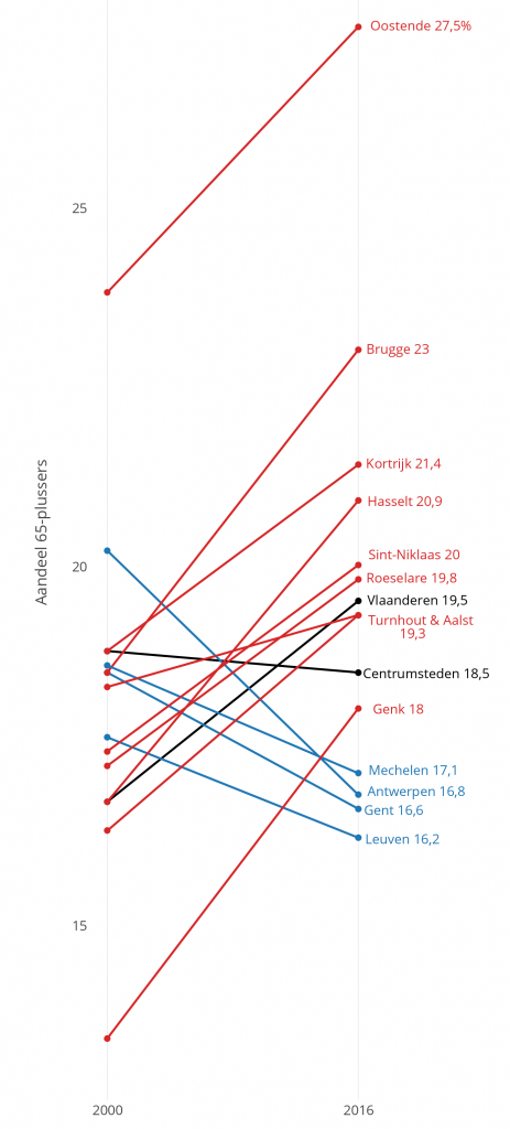
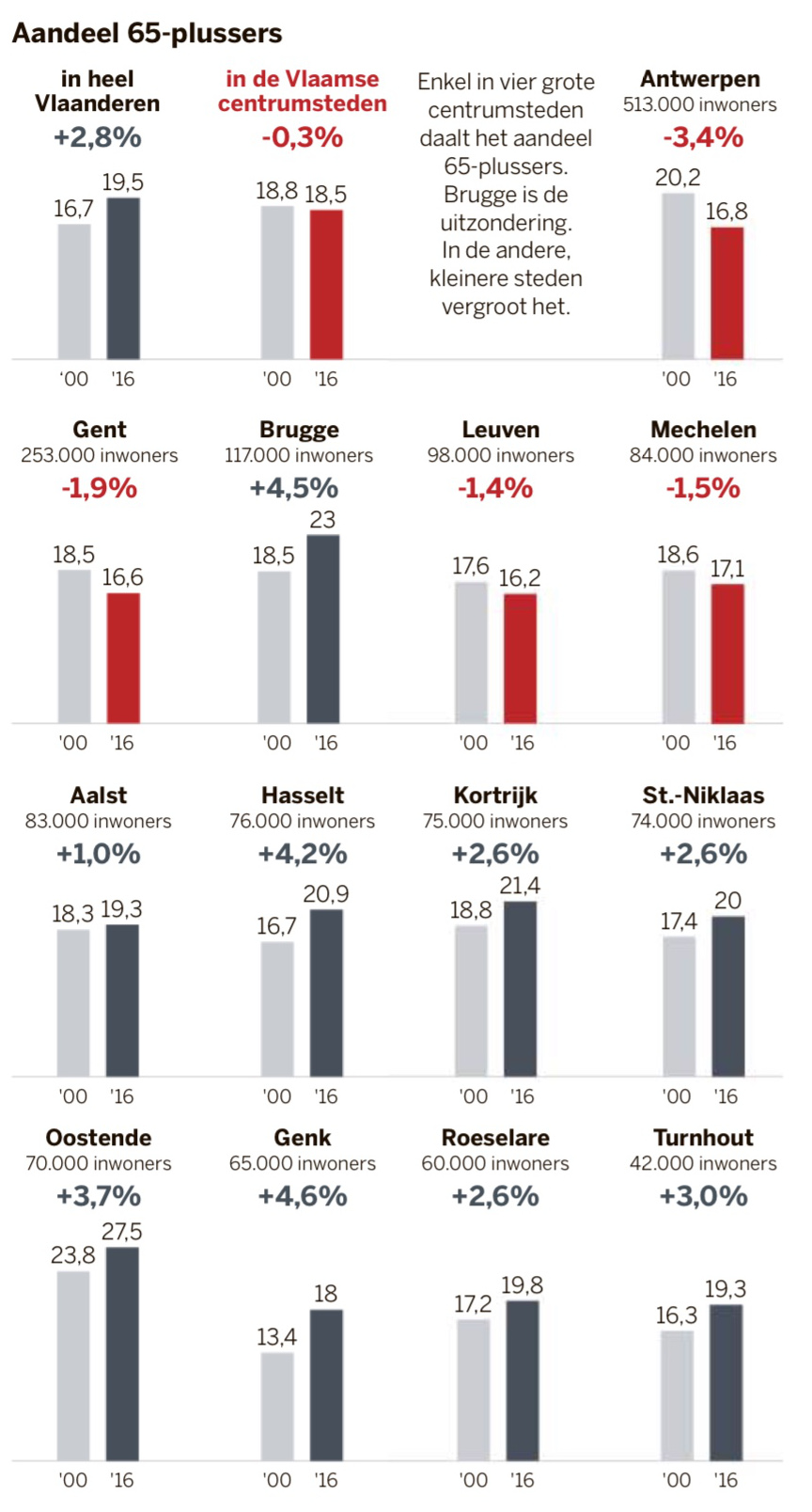
Today in Flemish newspaper De Standaard: 15 small bar charts, showing the share of elderly people in Flanders and its 13 biggest cities (link, paywall).
I noticed that for this data a slopegraph could really work, so I took a little time to make a redesign. The story explains that in 4 cities the share of elderly people went down (they are shown with red bars above) and that for other cities the share of the older population went up, even more then the average regional trend for Flanders.
See the charts below. Which chart do you find to be more supporting these stories? And which chart answers other question you might have about the data better? Reactions on Twitter were mixed.
I think the slopegraph is better becaus it
- only uses 1 scale, so comparing values is easier
- is denser, it has a higher data/ink ratio
- differences are clearer, becaus the scale doesn't have to start at 0
- trends are clearer, becaus the lines highlight them. By using bars, you leave it up to the reader to assess the trends
- is more elegant (yes, this is subjective)
Original
Redesign