Why you shouldn't use Infogram
October 25, 2015
The last few years saw the rise of dataviz tools for the masses and graphics-as-a-service. I think this is a good thing, as these tools increase data literacy in the general public and make entering this new field easy for anyone interested.
But the ease with which anyone can create interactive charts nowadays has its downfalls. In a professional environment (newsrooms, businesses and others) I think you should stay away from Infogram and similar tools for the production of simple day-to-day graphics. Here's why.
Disadvantages
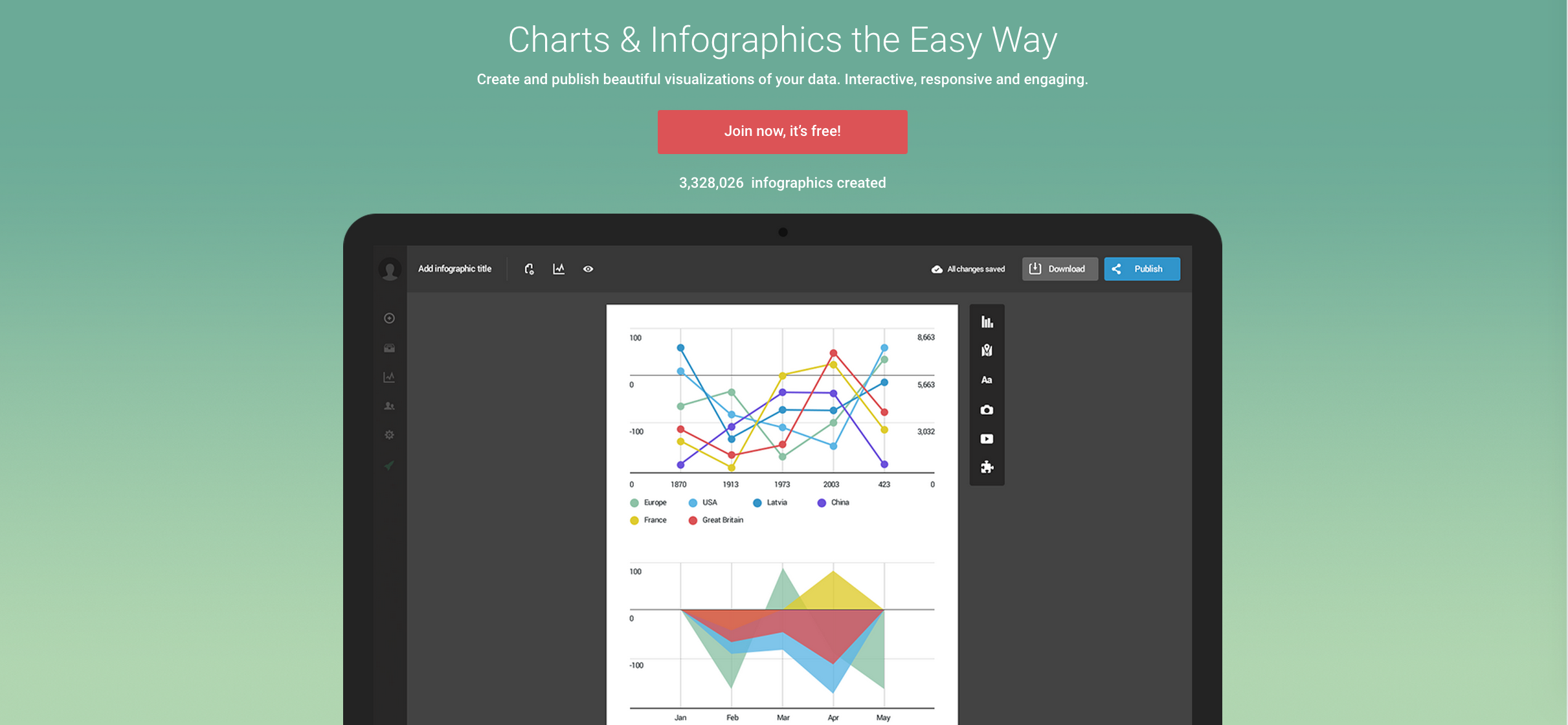
First of all: a lot of tools like Infogram are selling themselves as tools to create "engaging" graphics that "drag the eye of the reader". So expect a lot of colors, bold and weird fonts, ...
But it is not only the colors and fonts. A lot of the default settings of Infogram plainly violate the rules of good chartmaking. Among these defaults are:
- bars in bar graphs all have a different colors
- bars have no datalabels
- linegraphs have dense grids
- linegraphs have non-zero y-axes
- linegraphs often have vertical text
Of course you could argue that the user can always override these bad defaults. But the big majority of Infograms I encounter online use these defaults. I really don't know why Infogram goes for these defaults: this article shows that some people around Infogram do know the rules of clear datavisualization. Just compare the example Infogram in the article with the guidelines the author gives at the end: a very big contrast.
Furthermore, Infogram offers chart types that many data visualization specialists would call 'avoidable' or simply 'not done': donut charts, multiple axes charts (critique), radial bar charts (a post on the Infogram blog: 'The only reason to use a radial bar chart is aesthetics'), stacked area charts (critique).
Static graphics FTW
These are enough reasons already for avoiding Infogram and similar tools. But what I especially dislike, is that these tools generate "interactive" charts, where the only element of interactivity is showing labels when the chart is hovered over or clicked.
Typically, these tools are used for visualizing small datasets, that have no need for interactive features at all. In almost all cases, a static, image based graphic with appropriate labeling is superior to these semi-interactive visualizations.
Another advantage of static graphics is the shareability. It is much easier and much more straightforward to share an image than to share a graphic embedded in an iframe. Sharing an embedded Infogram inevitably leads you to the Infogram website, where your chart is viewed totally out of context. And you gain no clicks.
Other advantages of using image charts:
- In modern CMS's, working with images is easy. Most users know how to add an image to an article. Not so for inserting an iframe or a javascript embed.
- Also, a lot of CMS's filter out javascript in article body text completely.
- If you include the copyright information and the source of the data in the image, you can also make sure that these will always be shared along with the graphic.
And another consideration: when you use charting services like Infogram, you become dependent on the reliability of the service. As the Infogram Twitter timeline shows, outages are not so rare:
We're currently experiencing some issues with the app. We're working on fixing them and be up again soon. Thanks for your patience
— Infogram (@infogram) 29 september 2015
We're currently experiencing a service outage. We're working on fixing it and will be up again soon.
— Infogram (@infogram) 30 september 2015
Example to follow
In my view, Quartz is the example to follow here. They've built Chartbuilder, a static chart generator, and Atlas, a platform for hosting and sharing these static charts. They have opensourced their Chartbuilder, so anyone can clone this great tool for their own use.
If you are working in a newsroom, or any other professional environment that produces a lot of (simple) graphics, and you take datavisualization seriously, you should switch from Infogram or any other similar service to a static chartmaker like Chartbuilder.